










A cheerful way to refresh a keyboard without changing the board
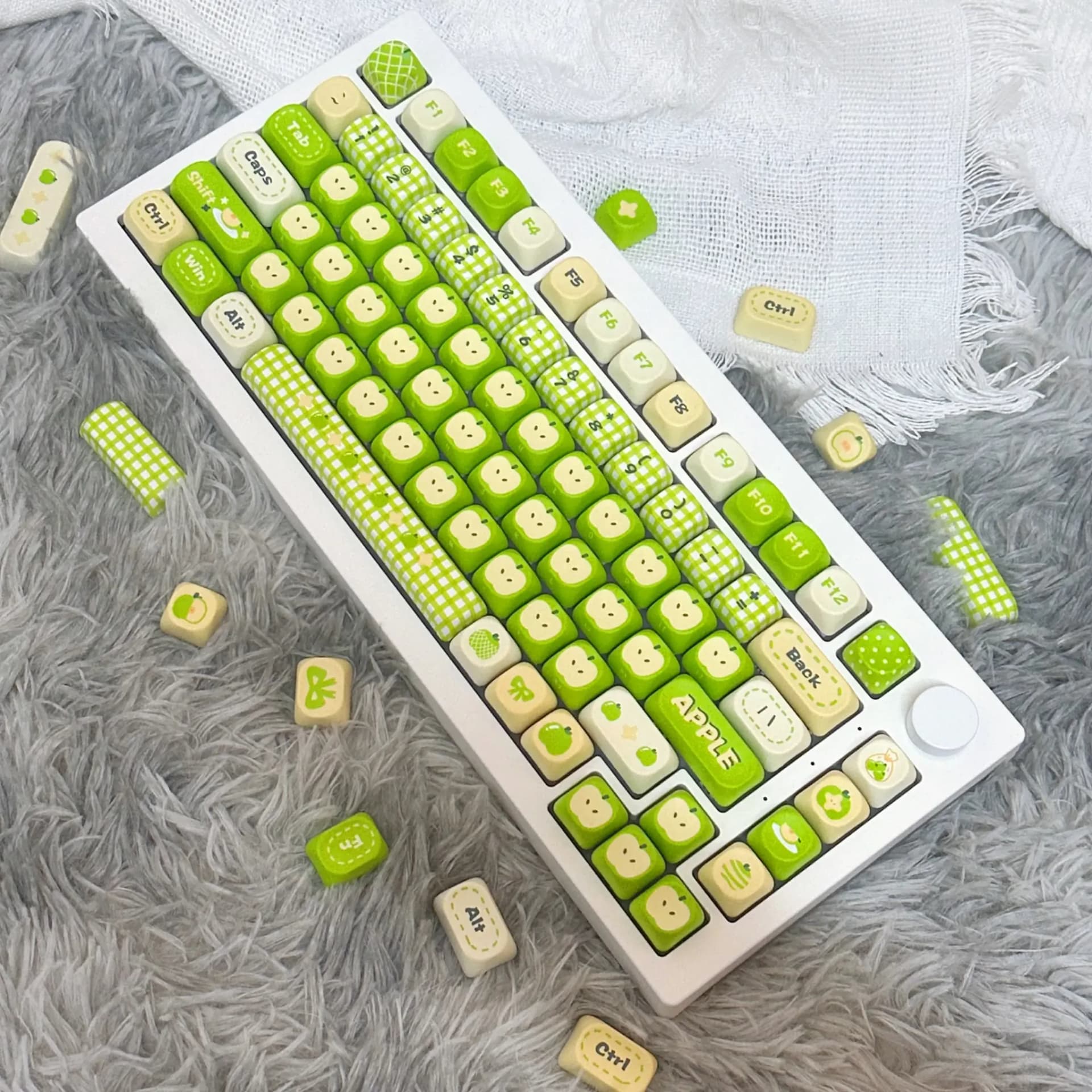
MAIMOOO has built a solid reputation in the AliExpress keyboard niche for designs that feel curated rather than random, and this set follows that pattern. The brand usually leans on themed aesthetics, sensible material choices, and layouts that are meant to work on real daily drivers, which is why this fruit-inspired set looks more considered than novelty-only options.
That matters here because a decorative keycap set still has to survive constant finger contact, light shine, and the occasional cleaning session. This one is aimed at users who want a keyboard that feels personal on the desk while still behaving like a practical typing upgrade, so the real question is how much style it adds without getting in the way.
MOA profile: softer shape, lower visual noise
The MOA profile is one of the biggest reasons this set stands out. Its rounded, shorter shape creates a softer visual line across the keyboard and tends to feel less sharp under the fingertips than taller sculpted profiles, which can make long typing sessions feel a little more relaxed.
Compared with Cherry or OEM keycaps, MOA usually looks more playful and compact, with a smoother “bubble-like” presence on the board. If you like a desk setup that feels cute but not cluttered, that profile does a lot of the aesthetic work before you even notice the color scheme.
PBT dye sublimation: where the practical value lives
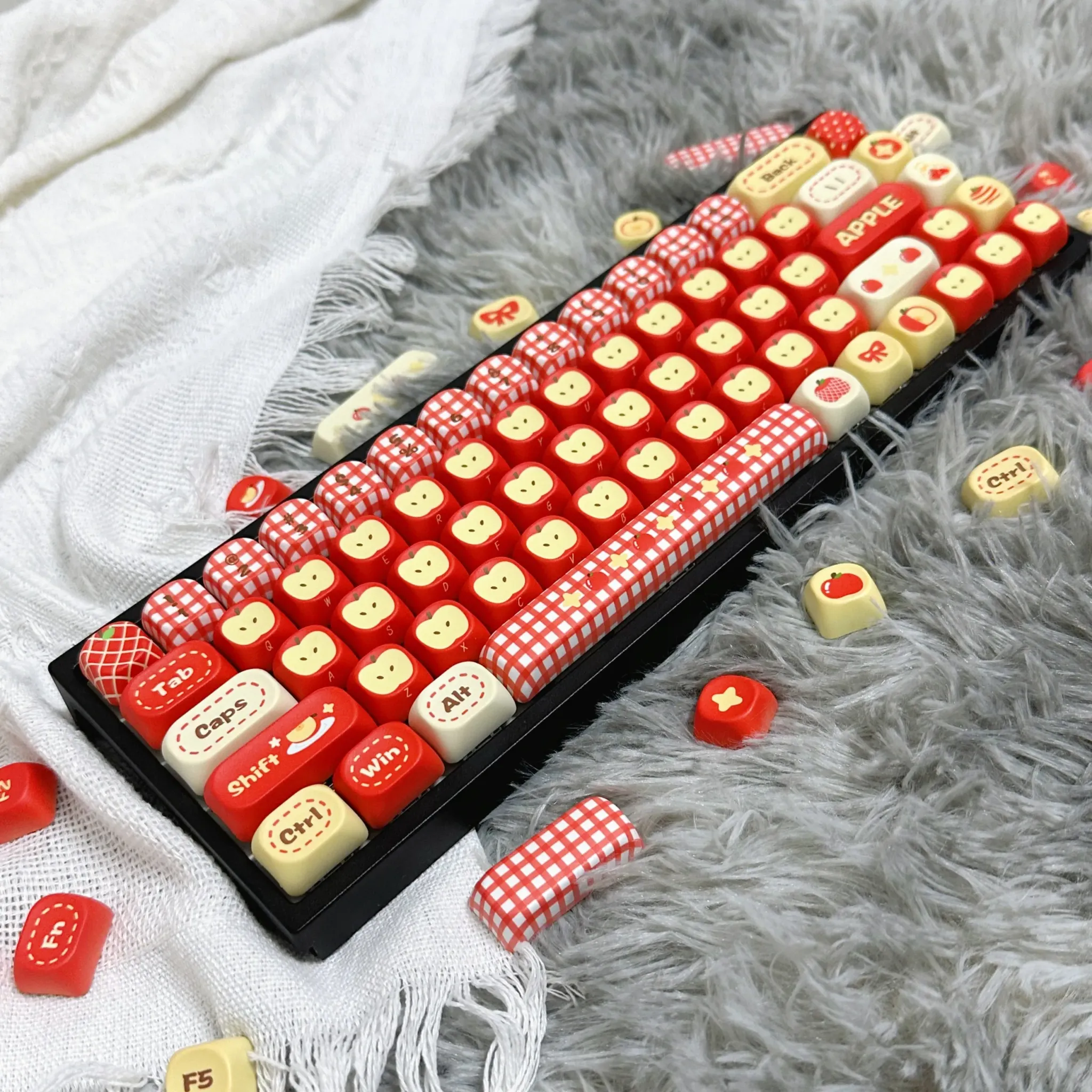
The PBT material is the more important spec for everyday use, because it is typically more resistant to shine than cheaper ABS keycaps. Users also describe the set as thick, and one review noted a slightly ceramic-like sound, which suggests a denser cap wall than the thin, hollow feel common in budget sets.
Dye sublimation is the right choice for a themed set like this because it helps the legends stay clean and readable over time. On a decorative keyboard, that means the artwork can remain crisp without looking like a printed sticker after a few weeks of heavy use, which is exactly what many themed sets fail to do.
97-key layout: a good fit for compact and mid-size boards
The 97-key layout is useful for users who want a near-full-size arrangement without giving up too much desk space. It typically suits compact TKL-style boards with a number pad section, so you get broader compatibility than a full artisan kit and less risk than buying a highly specialized layout.
That said, this is not a universal set for every keyboard shape, so checking stabilizer size, bottom-row spacing, and key count remains important before matching it to your board. For the right layout, though, it gives you a complete themed transformation rather than a few decorative accent caps, and that changes the whole desk presence.
What the reviews suggest after real use
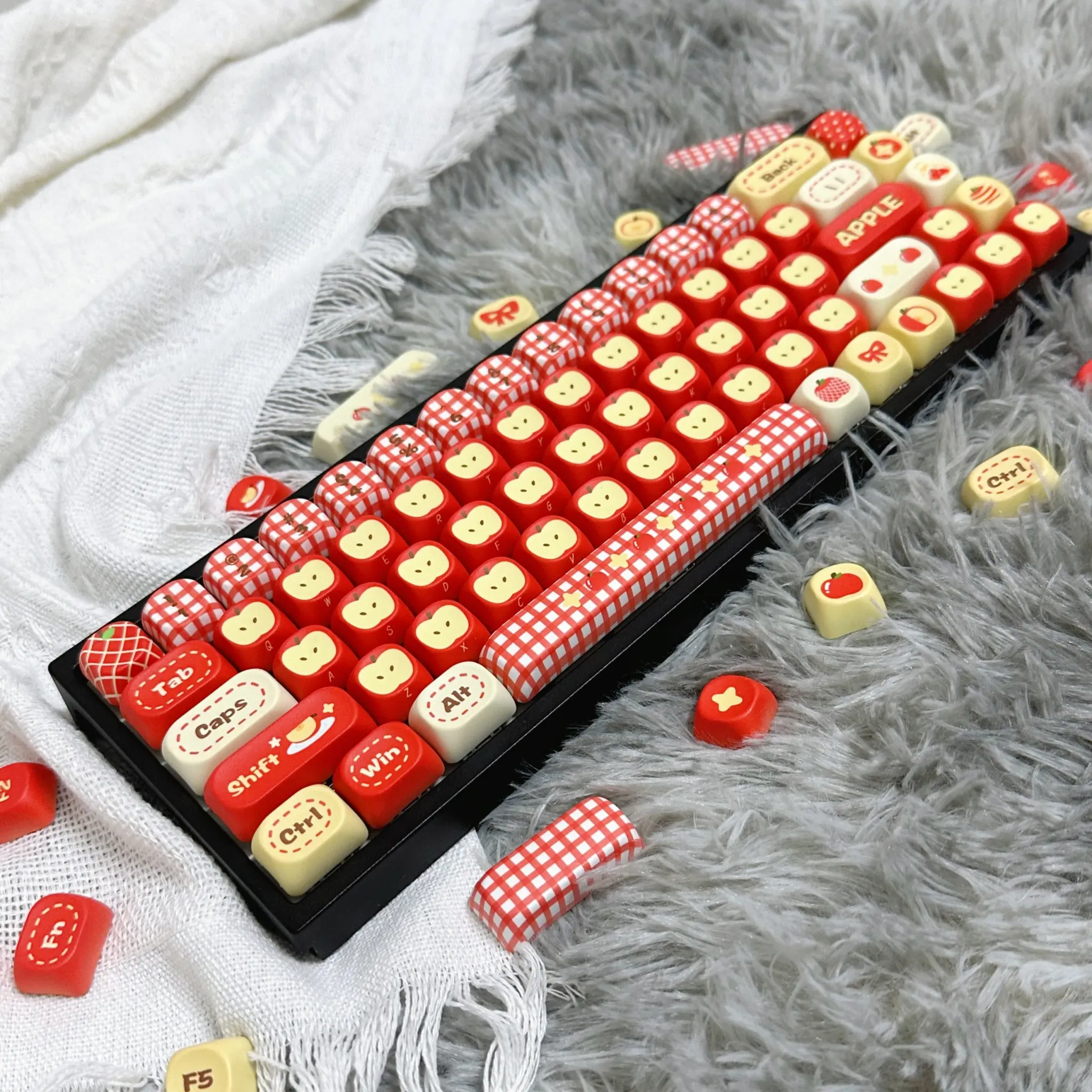
Early customer feedback is limited but very positive, with users praising the cute design, thick feel, and overall quality. One user also mentioned that shipping took a while, which is worth factoring in if you are planning a keyboard refresh around a specific date.
That pattern is encouraging because it points to a set that wins on first impression and still holds up once installed. If you care about both appearance and tactile character, the next question is whether the green fruit theme fits your setup or becomes the focal point of the entire desk.
Best for themed desks, gift builds, and everyday typing
This set makes the most sense for users who want a cheerful keyboard without moving into custom artisan territory. It also works well as a gift for mechanical keyboard fans, since the theme is easy to understand at a glance and the PBT construction gives it a more substantial feel than many novelty options.
For minimalist setups, the colorway may be too expressive, but that is also the point of the product. If your desk already has playful accessories, soft lighting, or pastel hardware, this is the kind of set that can tie everything together instead of competing with it.