




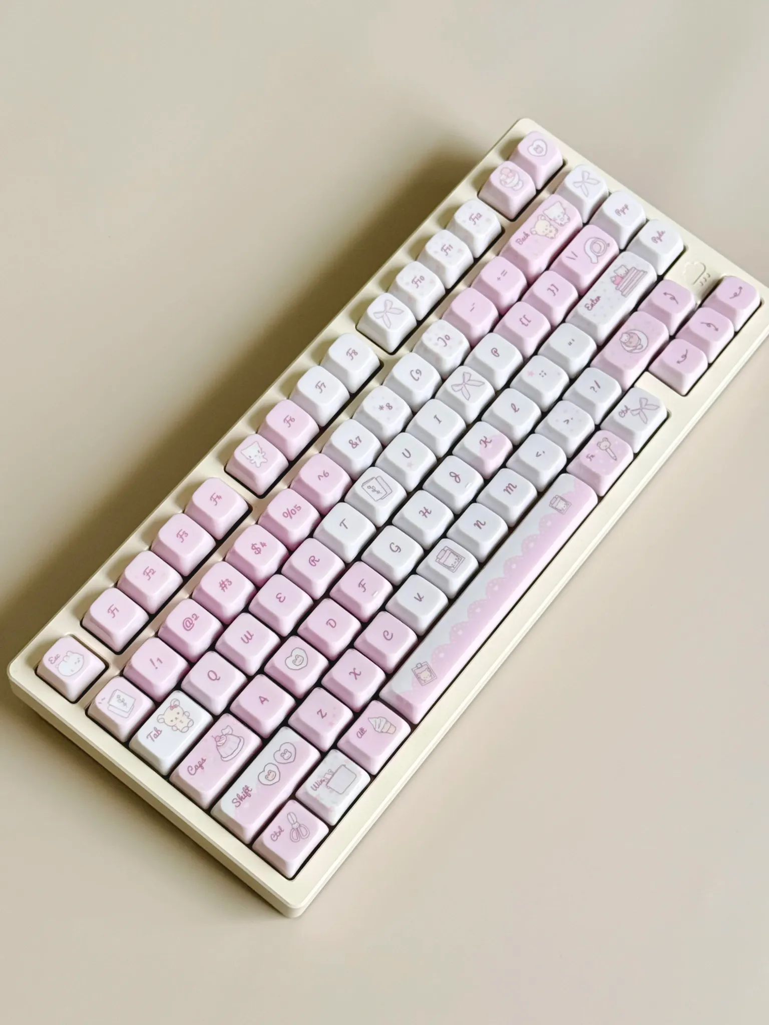
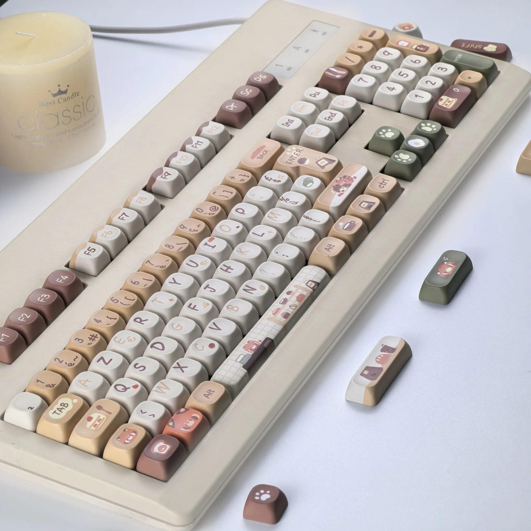
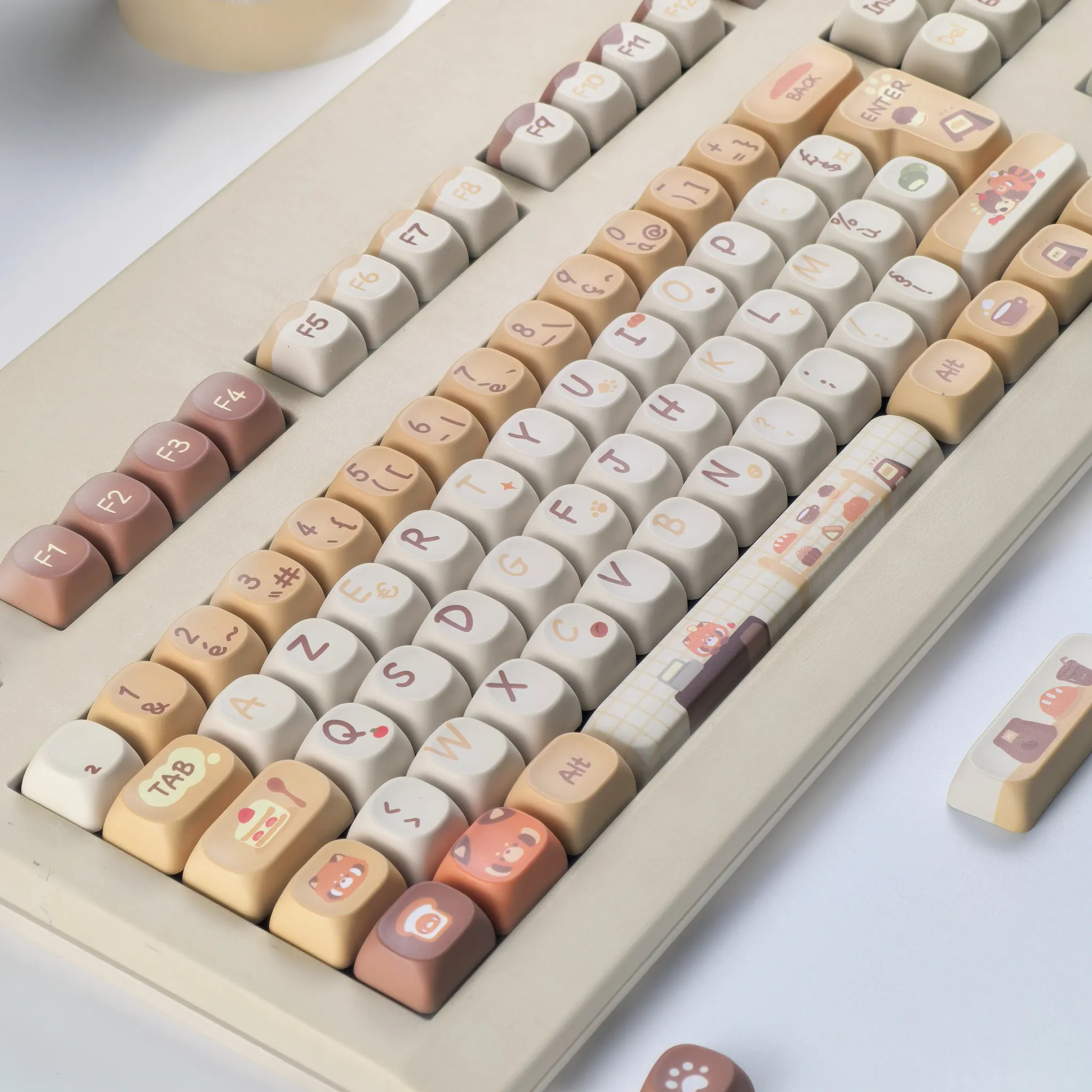
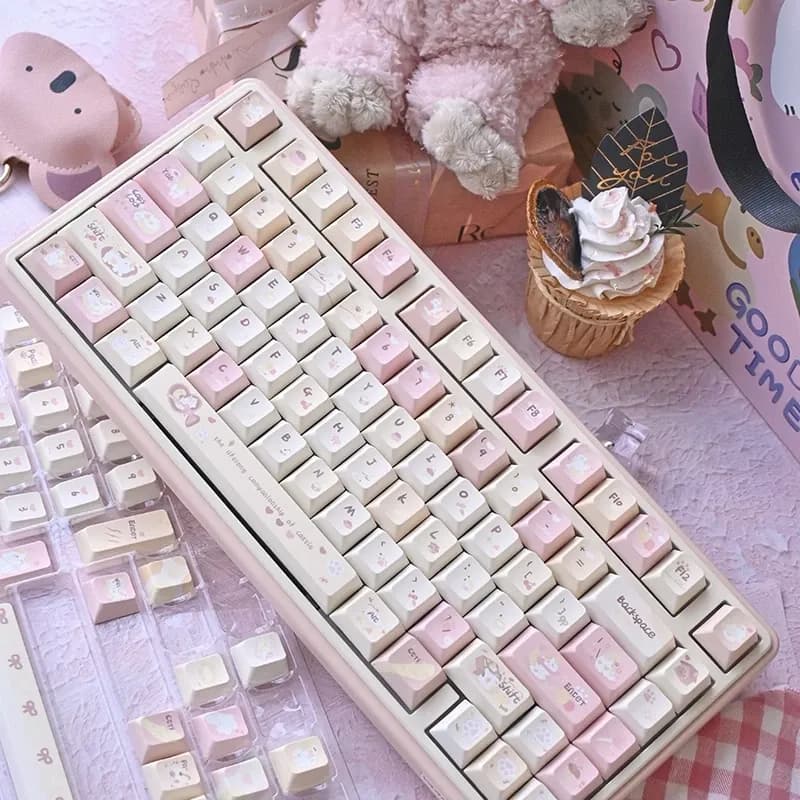
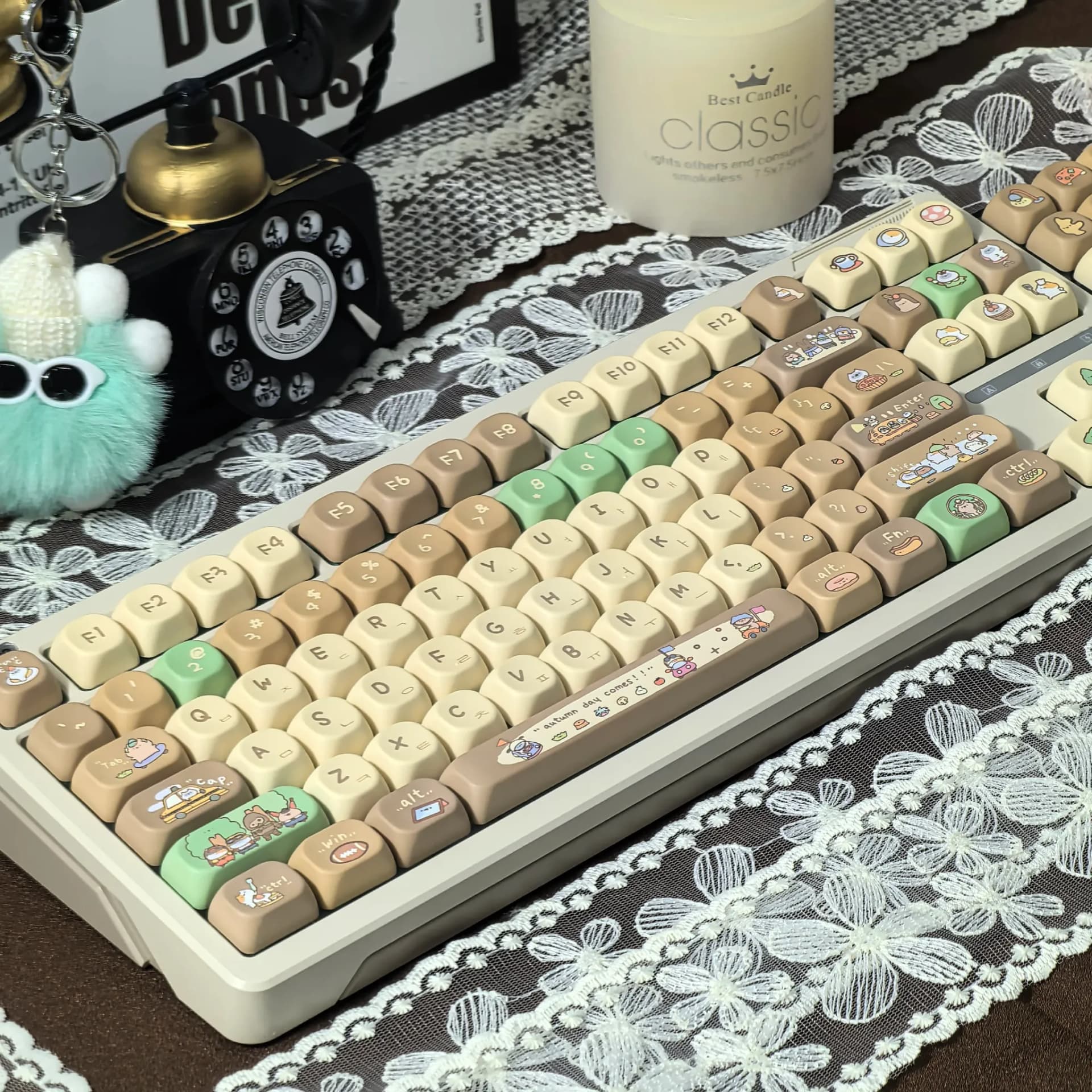
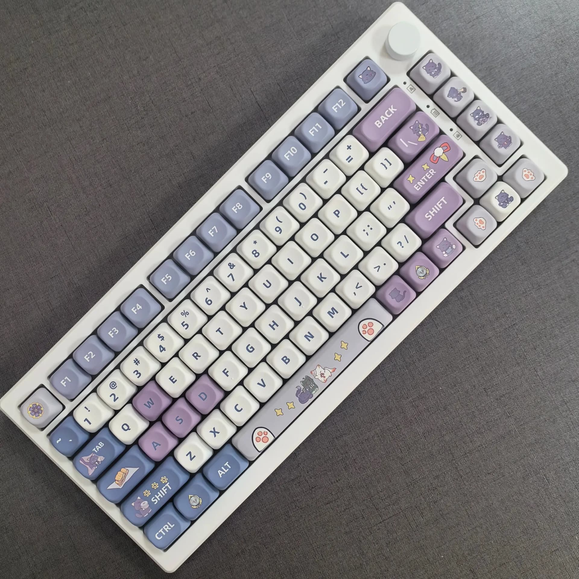
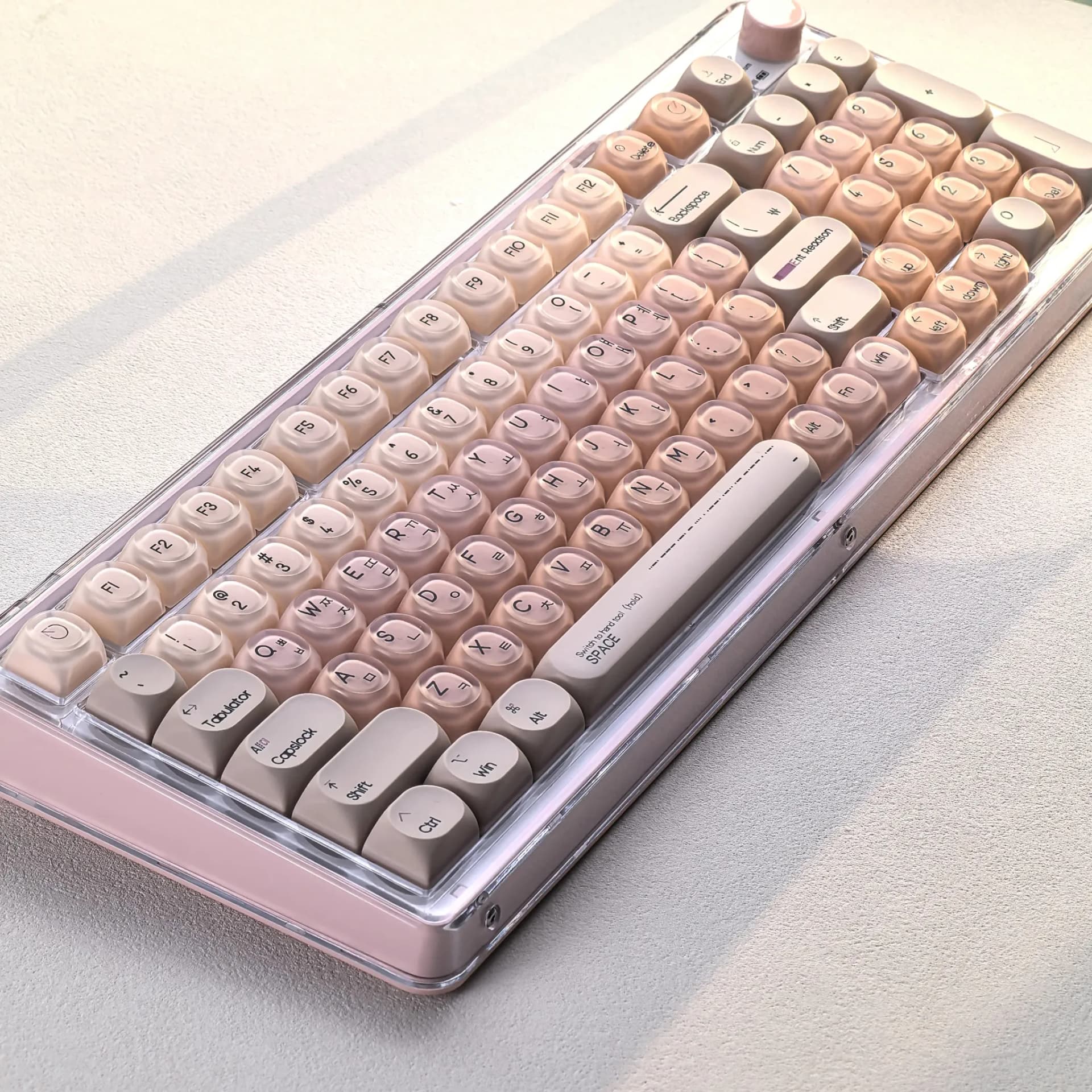
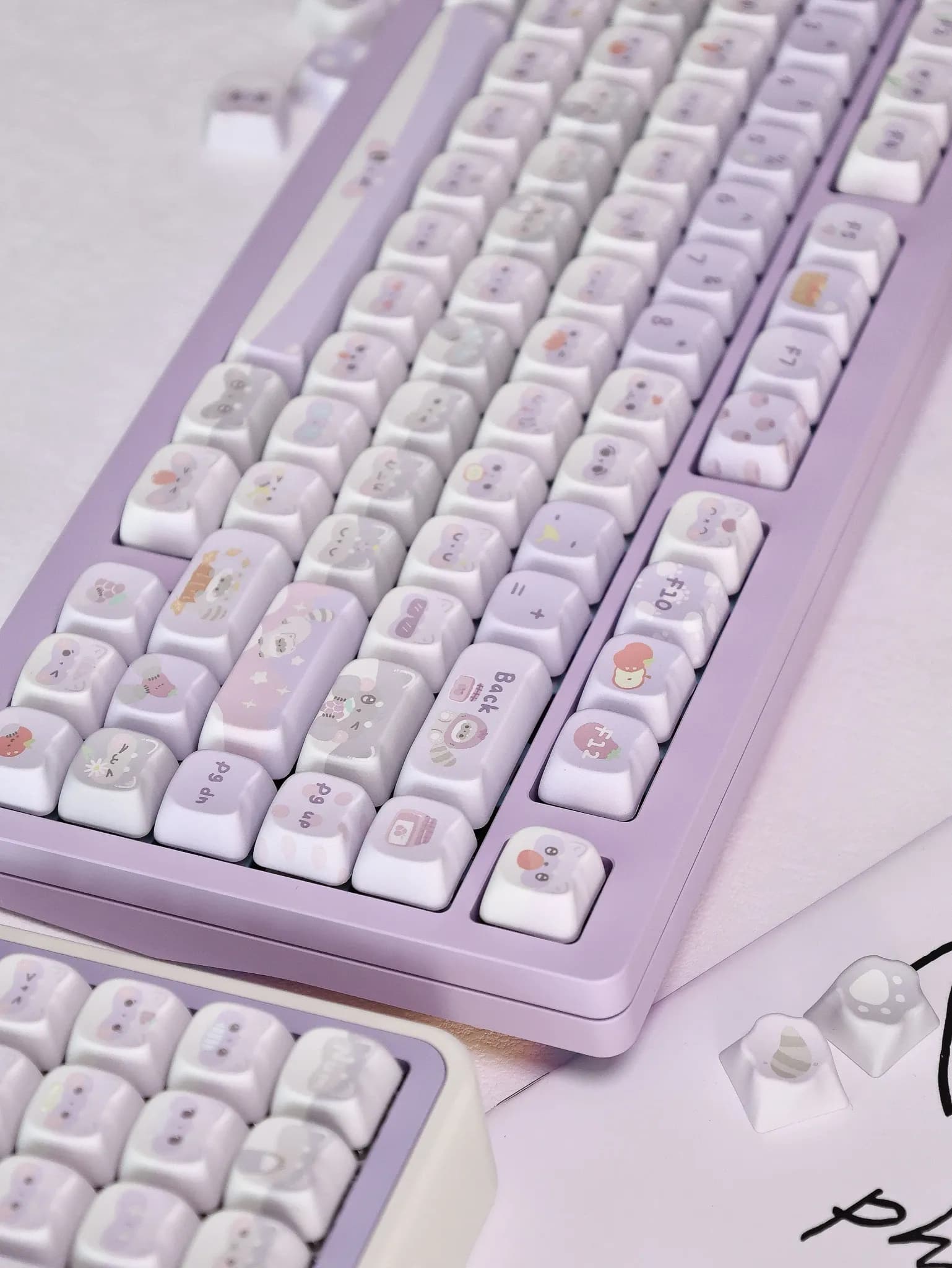
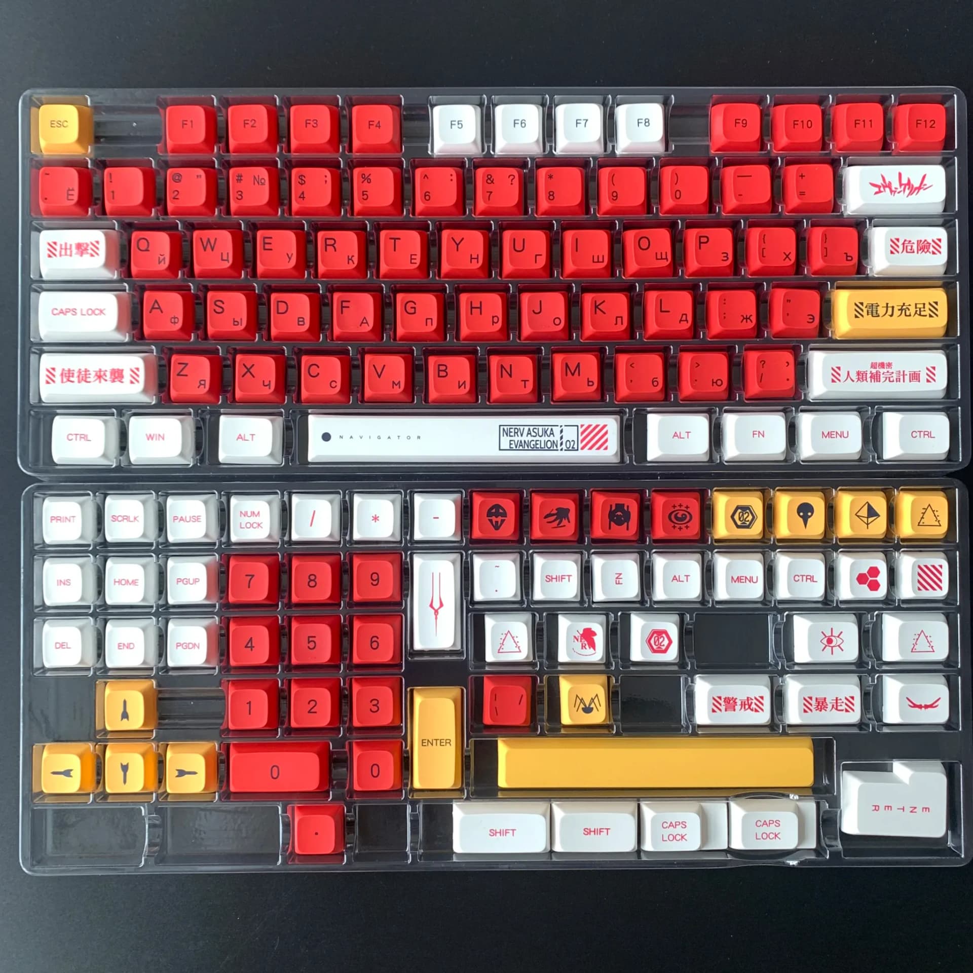
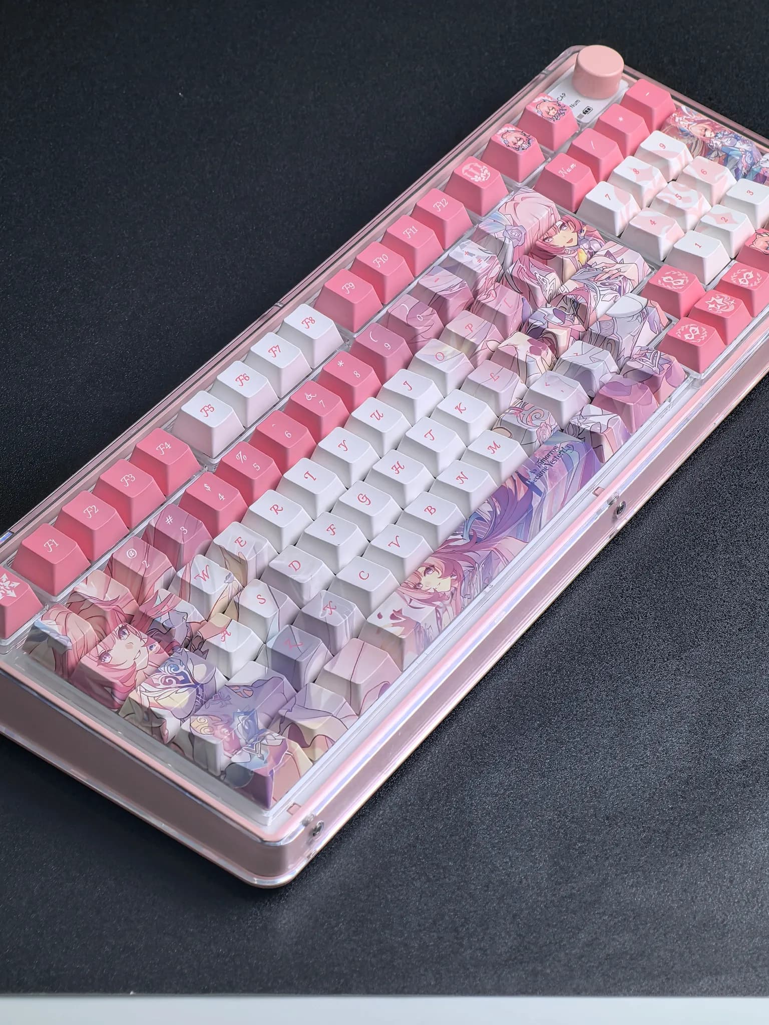

MAIMOOO’s approach to keycaps feels more refined than the average AliExpress set
MAIMOOO has built a solid reputation in the AliExpress keyboard niche by focusing on practical details that matter after the first week of use: stable legends, consistent molding, and materials that hold up better than thin ABS sets. This Russian-layout set follows that pattern, aiming at users who want a more distinctive board without sacrificing typing comfort.
The appeal here is not flashy presentation but a balanced mix of durability and usability, which is why the brand stands out among budget keycap sellers. If you have been looking for a layout change that also improves the feel under your fingers, this set is worth a closer look.
PBT texture and dye sublimation: why it matters in daily typing
PBT is the main reason this set feels more premium than its price suggests, because it usually resists shine and wear better than softer plastics. In practice, that means the surface should keep a drier, slightly textured feel that helps fingers stay planted during long typing sessions.
Dye sublimation is the other important detail, since it places the legends into the plastic instead of sitting on top like a printed layer. That usually improves long-term readability, especially for users who type often and do not want the characters to fade into a glossy blur.
XDA profile: a flatter typing angle with a softer hand feel
The XDA profile is noticeably different from tall sculpted profiles such as OEM or Cherry, because each row sits at a more uniform height. That creates a wide, relaxed landing surface that can feel easier for touch typing and more forgiving if you move between rows quickly.
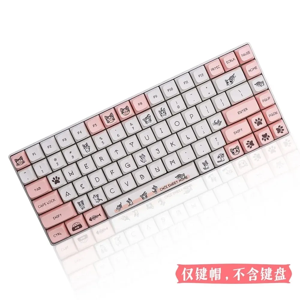
Users who liked the sample reviews often mention pleasant plastic and comfortable blind typing, which fits the XDA profile well. The flatter shape is not for everyone, though, since some typists prefer more row definition for faster orientation, so the feel is part of the decision here.
Russian legends: useful if you want a distinctive layout or bilingual setup
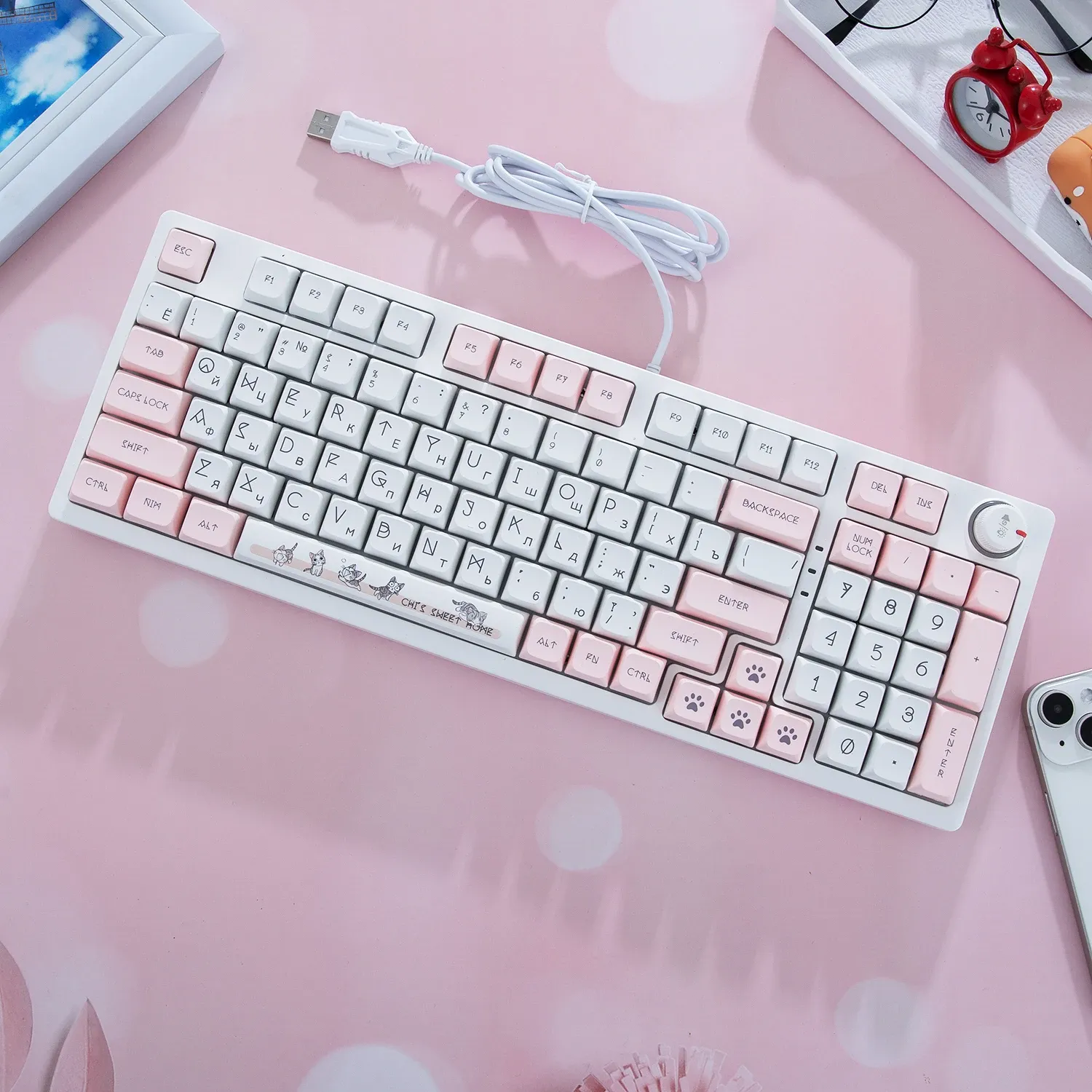
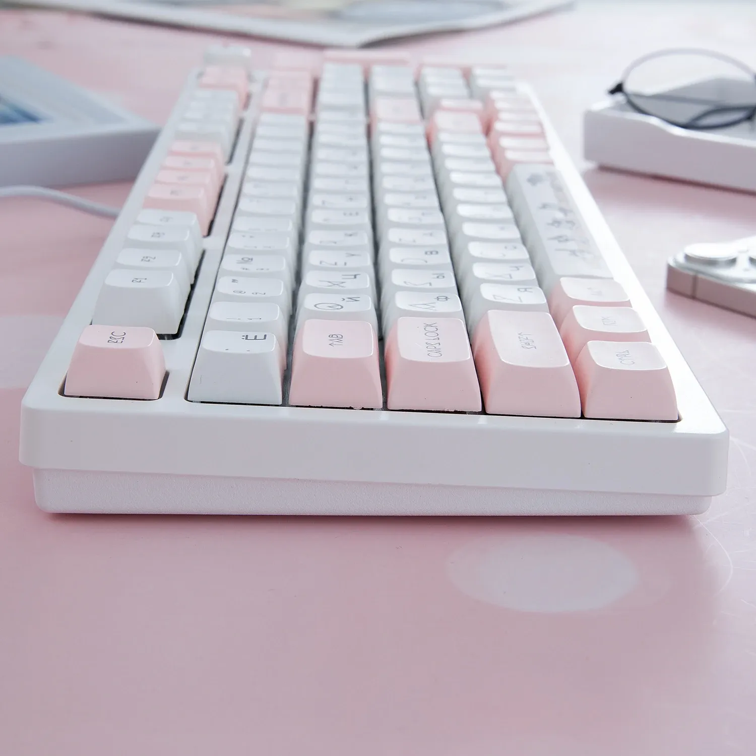
The Russian character set gives this keycap set a clear identity and makes it more useful for bilingual desks, learning environments, or themed builds. It also changes the visual rhythm of the keyboard, turning an ordinary board into something that looks more specialized and deliberate.
Because the legends are more character-rich than standard English-only caps, they can take a short adjustment period for some users. That trade-off is part of the charm, and it becomes less noticeable once muscle memory takes over, which is exactly what the strongest customer feedback suggests.
Fitment across 108, 104, 96, 87, 61 layouts
This set is positioned for a broad range of mechanical keyboards, including full-size, tenkeyless, compact, and 96-key layouts. That flexibility matters if you swap boards often or want one set that can move between a work keyboard and a gaming setup.
The main compatibility checkpoint is the switch stem, since the listing is aimed at Cherry MX-style boards and compatible clones. If your board uses a standard cross-shaped stem, the set should be easy to mount, but unusual bottom-row sizes still deserve a quick check before you commit.
What the value looks like at this level
At $19.11, the set sits in a range where many buyers expect only basic cosmetics, yet the material choice and dye-sub legends push it above that expectation. It is a sensible upgrade if you want a keyboard that feels calmer, sounds a little more muted, and looks cleaner on the desk.
Compared with many low-cost keycap kits, this one is less about gimmicks and more about steady daily use. That makes it especially appealing for users who care about typing feel first and visual novelty second, which is where the strongest value usually shows up.
Real-world feedback points to comfort and pleasant plastic
Customer feedback is limited but very positive, with users highlighting the pleasant texture, attractive kitten-themed design language, and comfortable blind typing. That kind of response usually points to a set that does the basics well, rather than one that relies on marketing claims.
The only clear caution is that the character design may take a little adjustment if you are used to standard English legends. Once you are past that learning curve, the layout becomes the feature that gives the board its personality, so what matters most is how you plan to type on it.