



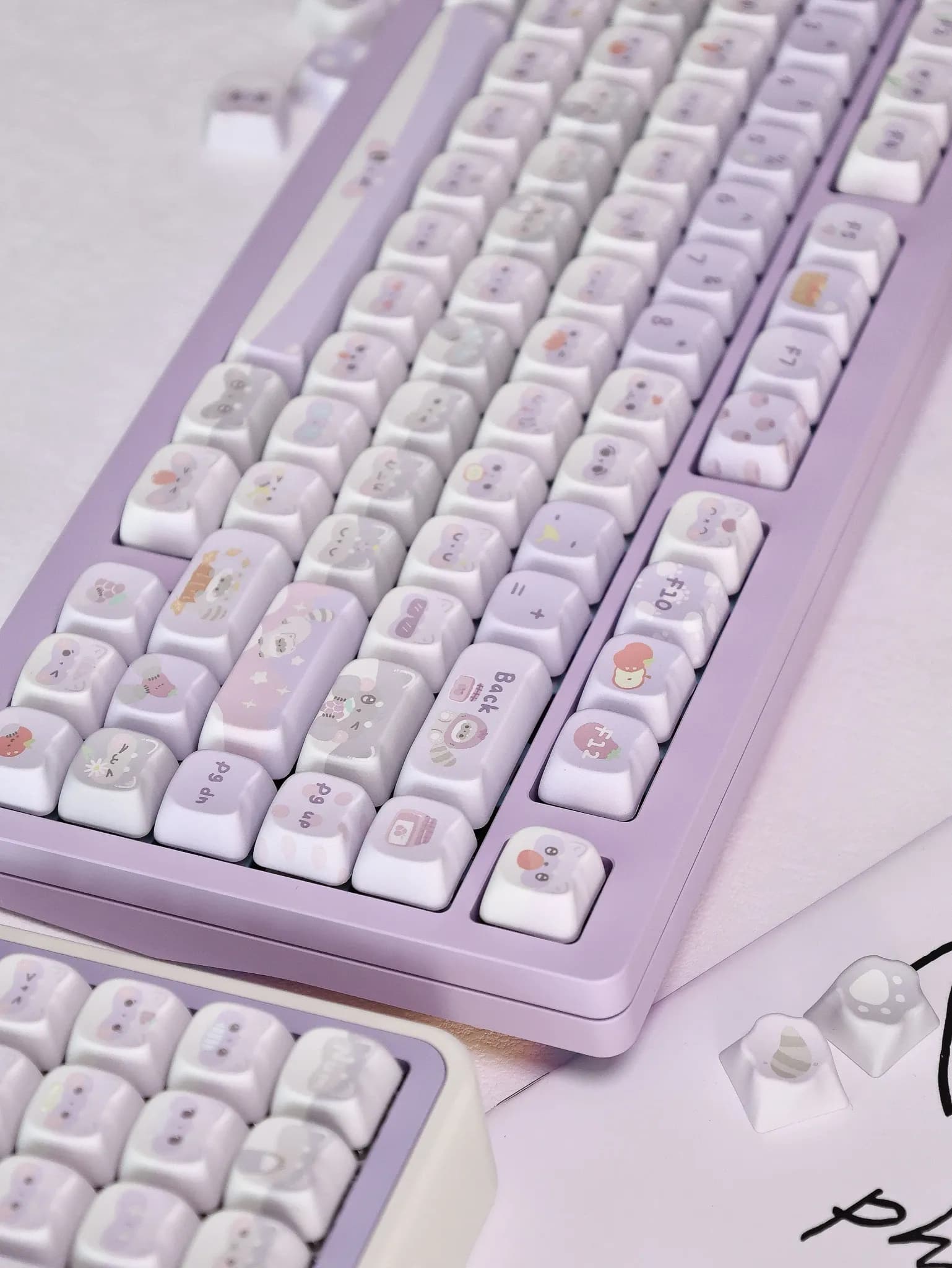
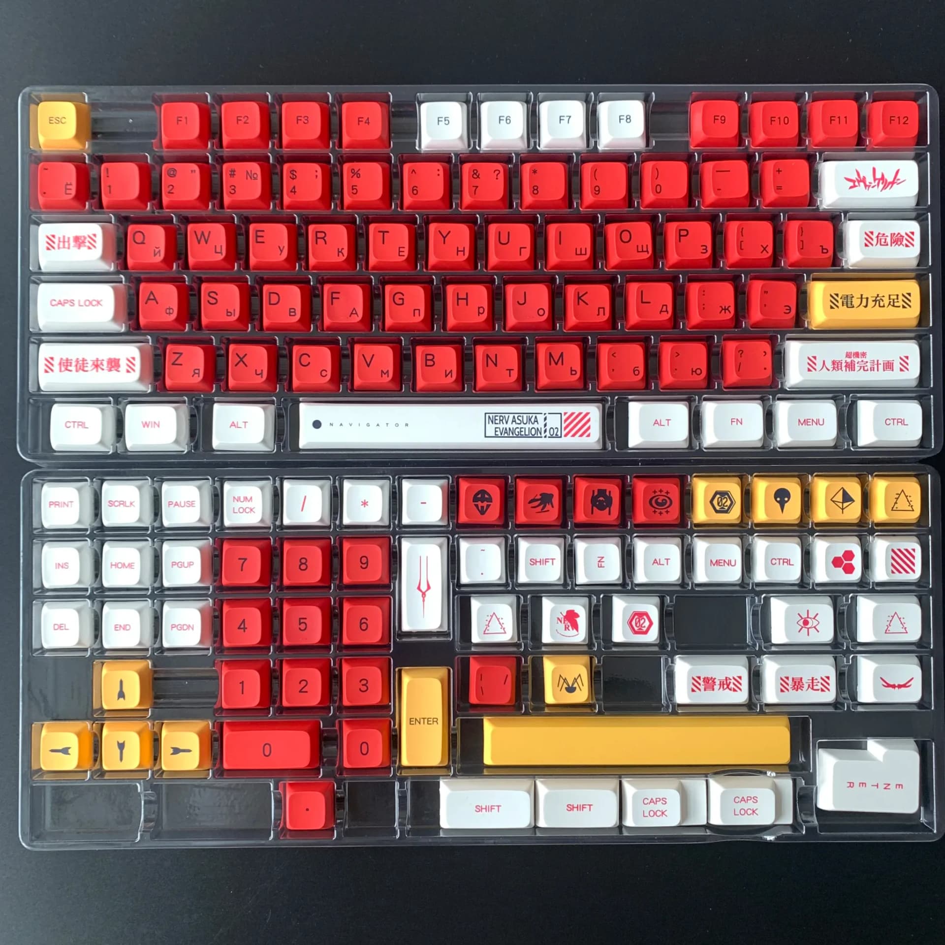
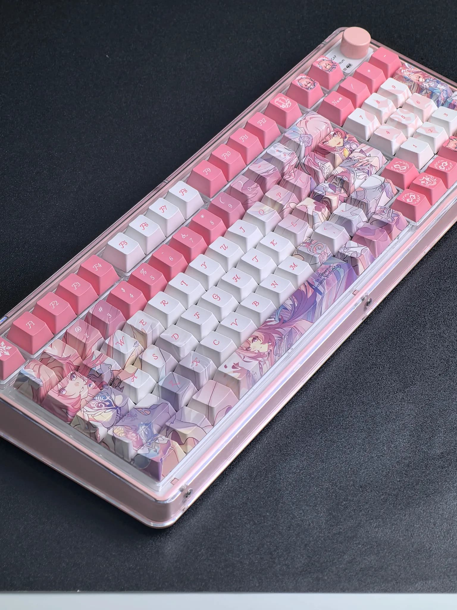
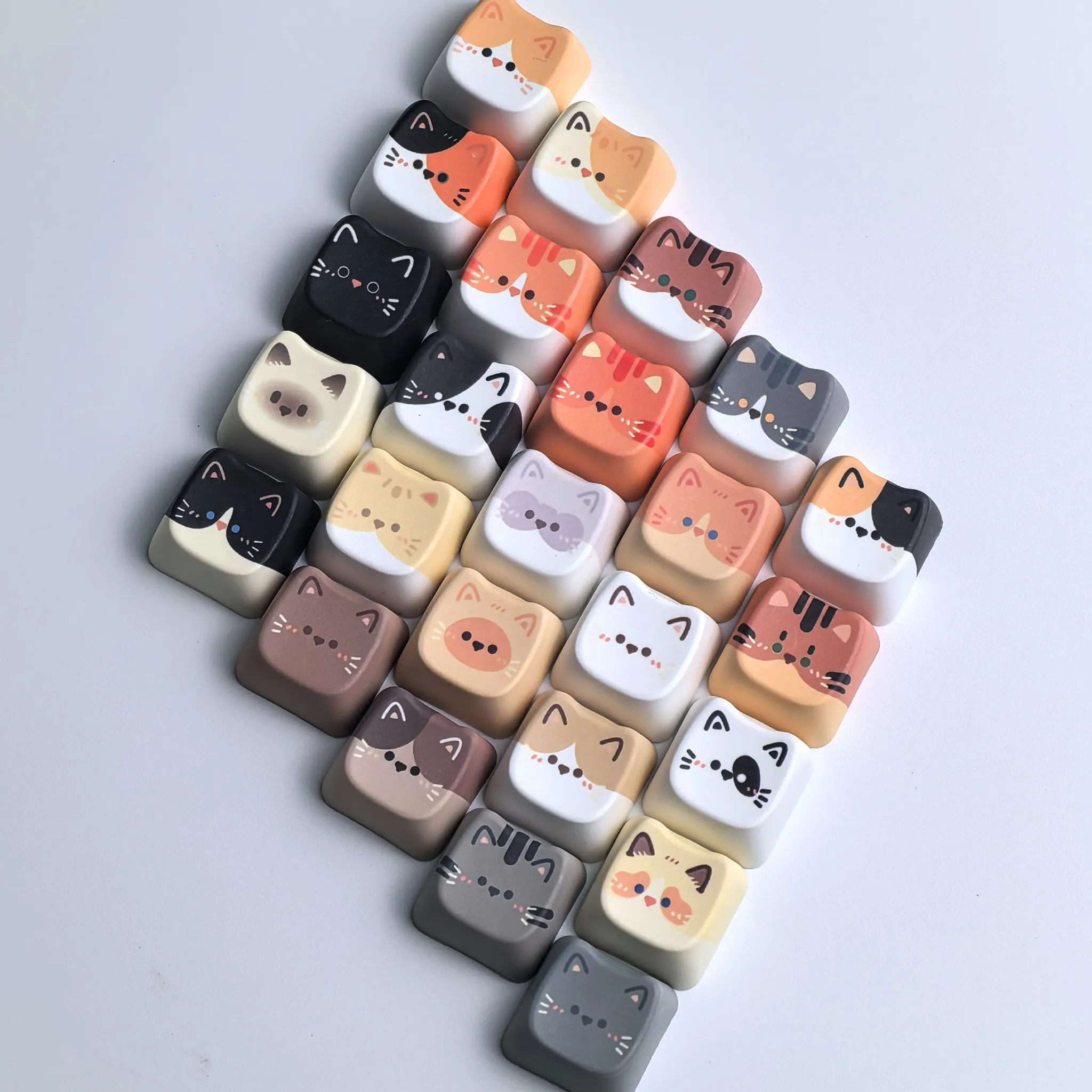

A softer colorway that changes the whole desk mood
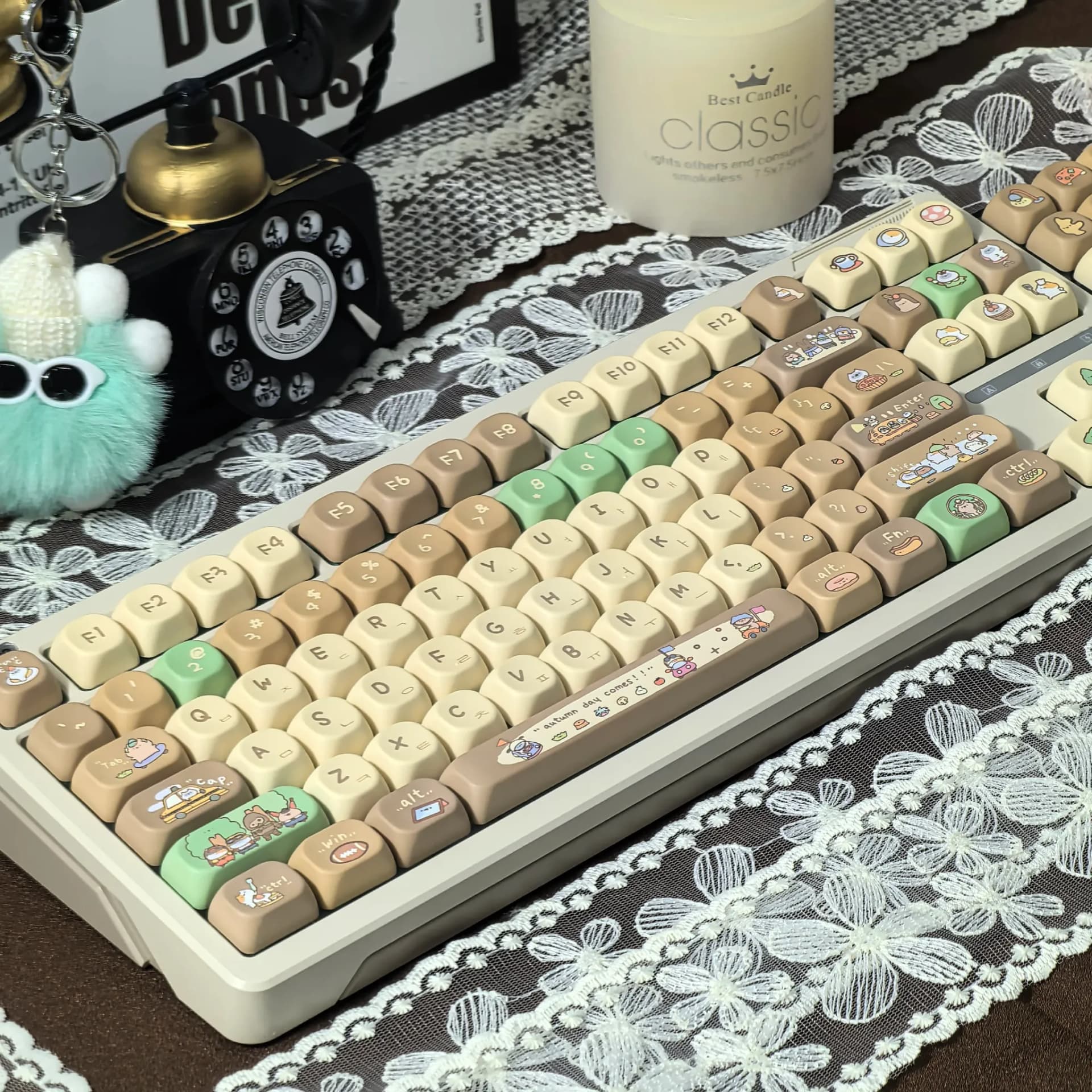
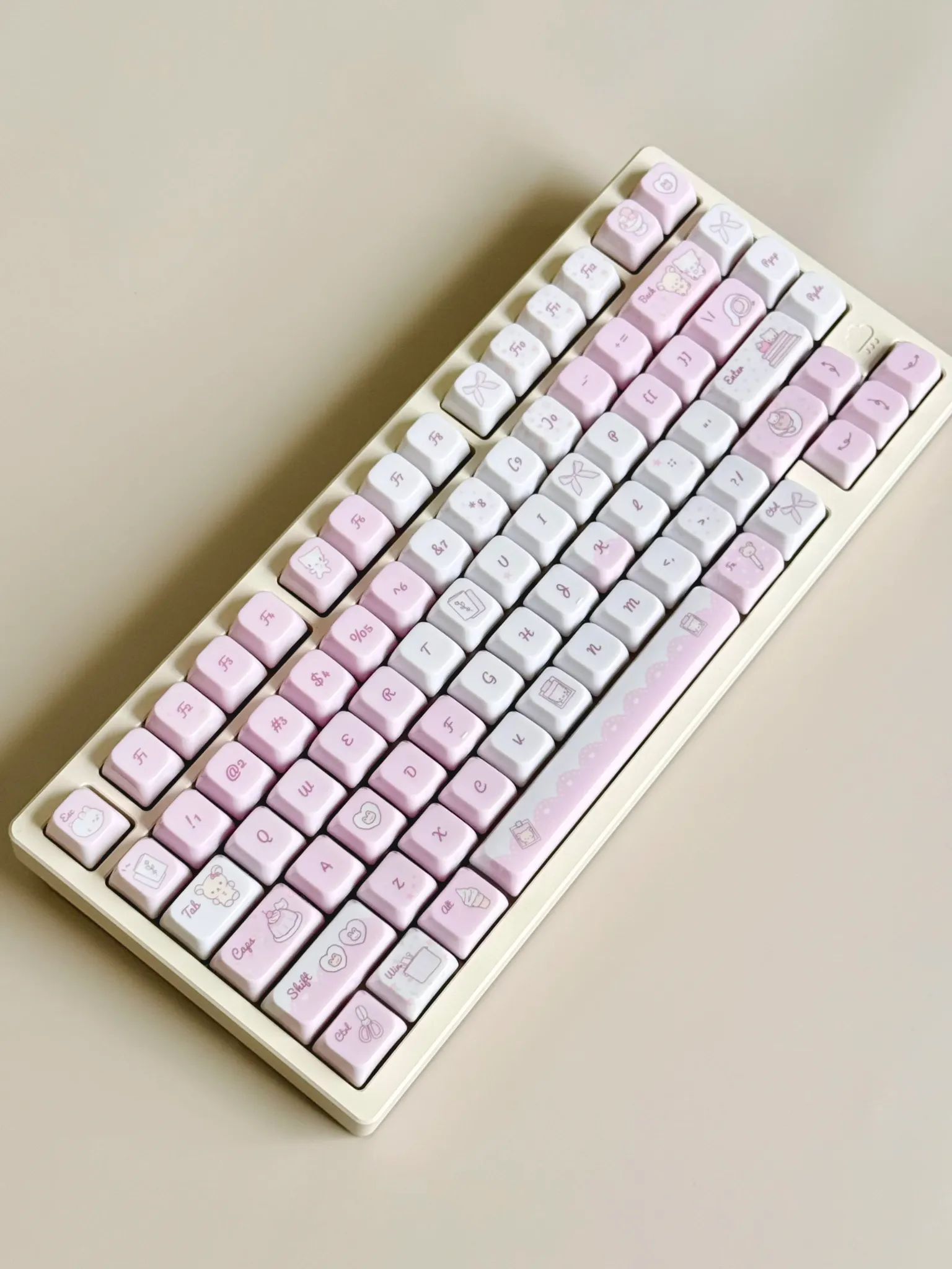
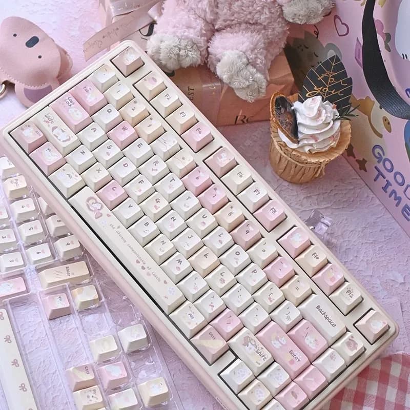
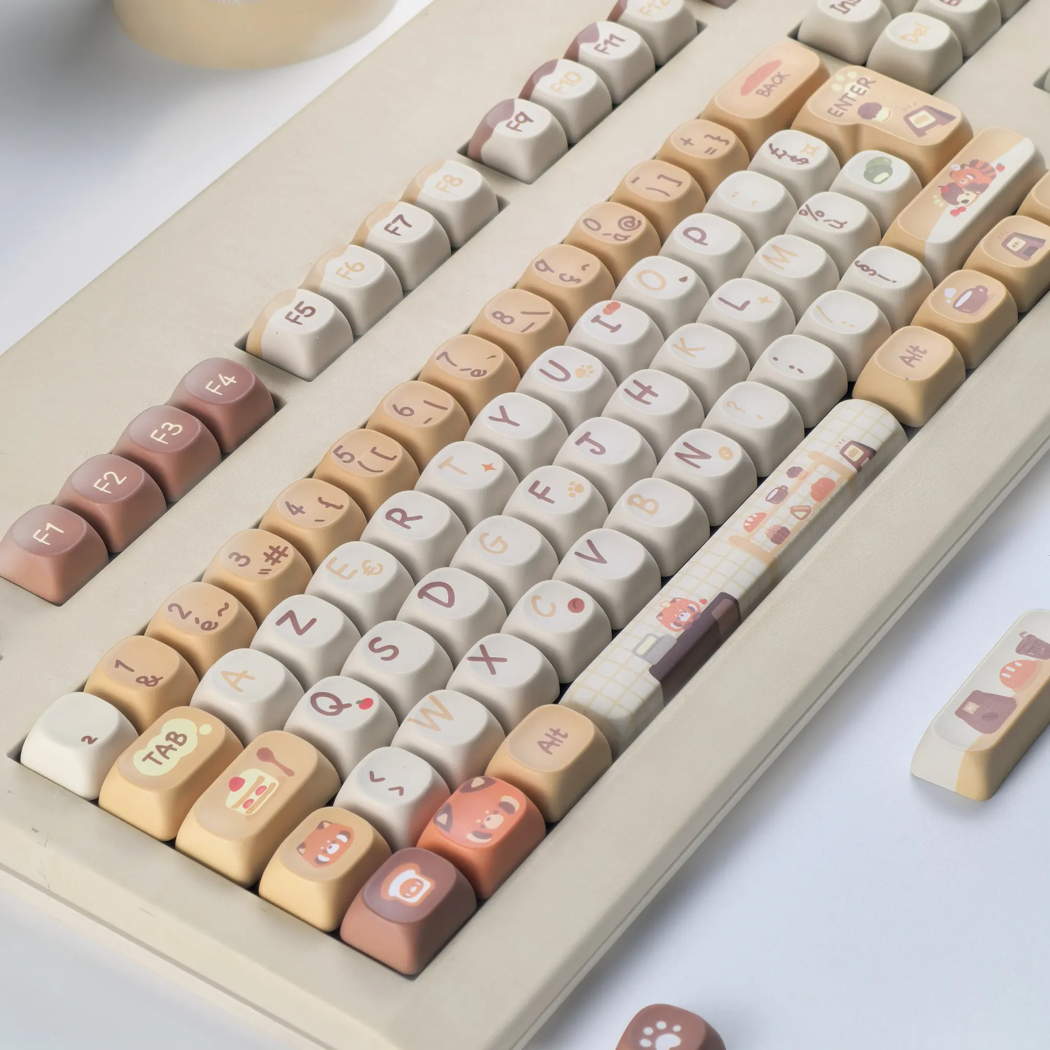
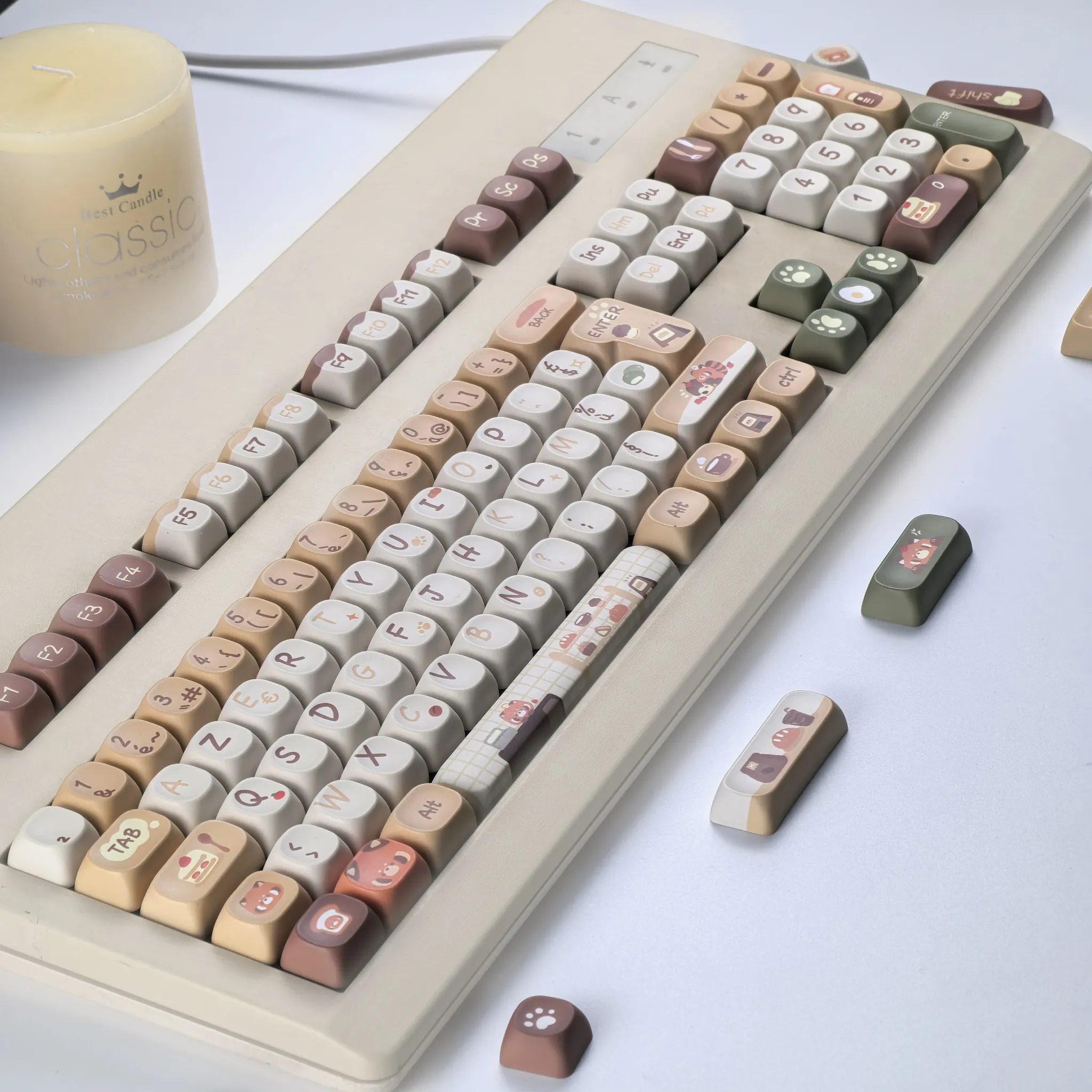
This set solves a common problem for mechanical keyboard fans: a board that works well but looks too sharp, too loud, or too generic. MAIMOOO answers with a muted khaki and cocoa palette that feels calmer on the desk and easier on the eyes during long sessions.
MAIMOOO has built a solid reputation in the AliExpress keyboard niche by focusing on themed keycap sets that balance visual identity with practical materials. That shows here in the restrained color blocking, clean legend placement, and a presentation that feels more curated than novelty-driven, which is exactly what many users want from an accessory brand.
MOA profile: why the shape matters in daily use
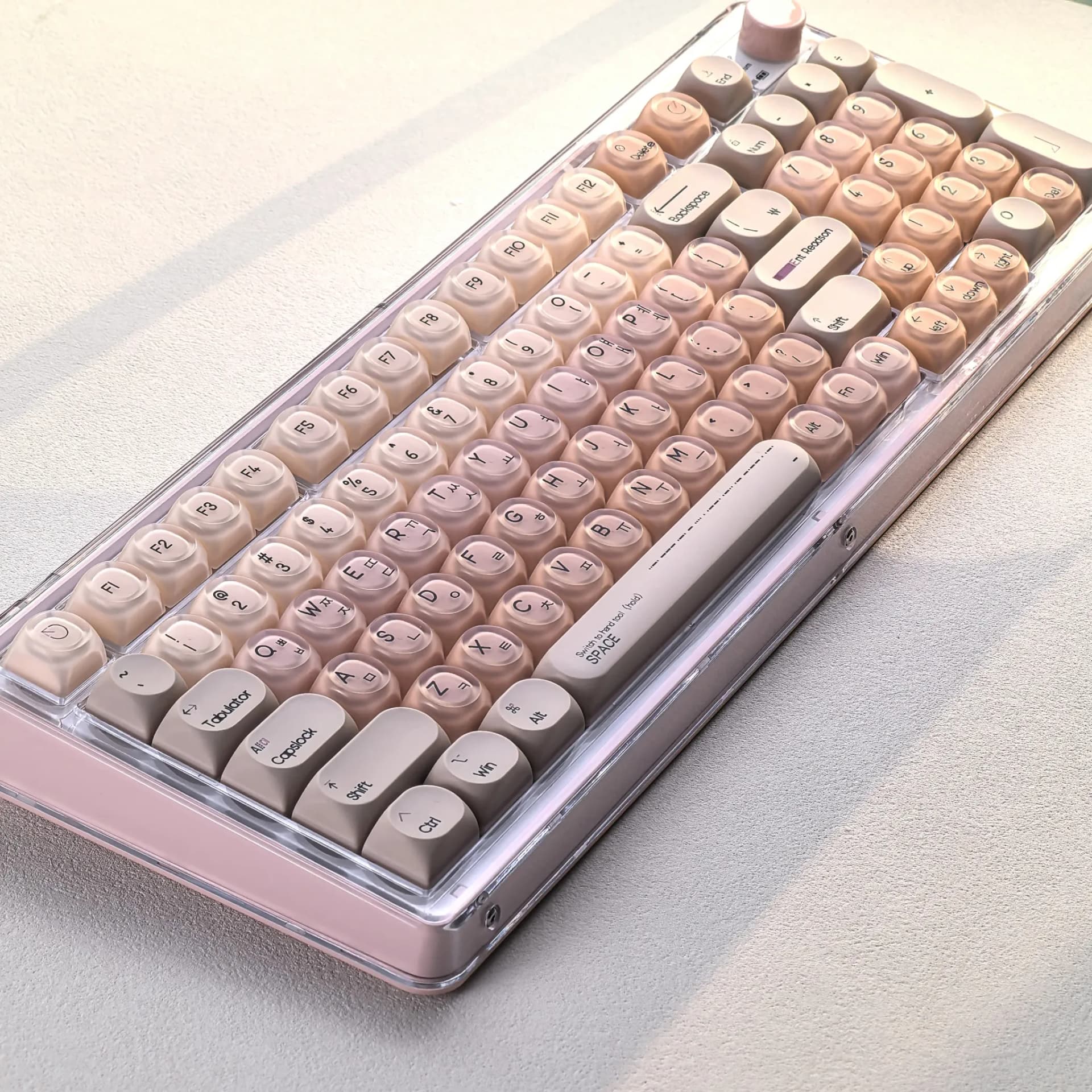
The MOA profile is the real comfort story here, because its rounded, uniform shape creates a softer typing surface than taller, more angular profiles. If you enjoy a cushioned fingertip feel and a compact visual silhouette, this profile can make a board feel less aggressive without changing the switch itself.
Compared with OEM or XDA-style sets, MOA usually sits in a middle ground that feels playful but not toy-like. That makes it a smart option for office desks, home setups, and aesthetic builds where the keycaps should look intentional rather than flashy, and the next detail explains why the material choice supports that goal.
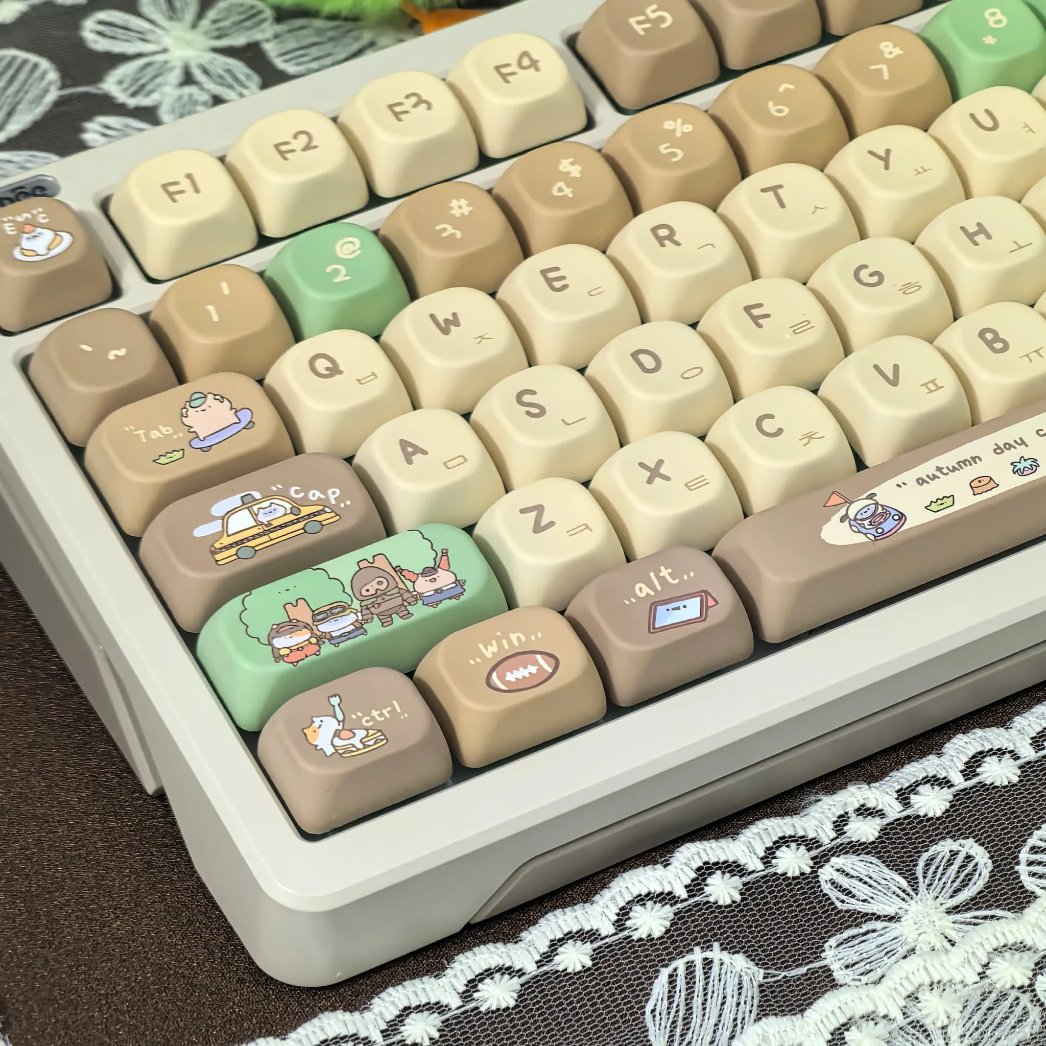
PBT with dye sublimation: built for long-term legibility
PBT is valued because it resists shine better than common ABS keycaps, so the surface should hold its texture longer under frequent use. Thermal dye sublimation also helps the legends stay crisp, which matters on a bilingual set where the English and Russian characters need to remain readable over time.
Users who prefer a dry, grippy keycap surface will likely appreciate the practical side of this construction. One customer review called the set good quality with fast delivery, and that brief feedback aligns with what the specs suggest: a straightforward, reliable upgrade rather than a showpiece that sacrifices durability for looks.
Russian and English legends: useful beyond the aesthetic
The bilingual layout is more than decoration, because it can help multilingual typists, collectors, and people building region-inspired setups. It also gives the board a distinctive editorial look, with the Cyrillic characters adding texture to the design without making the legends feel crowded.
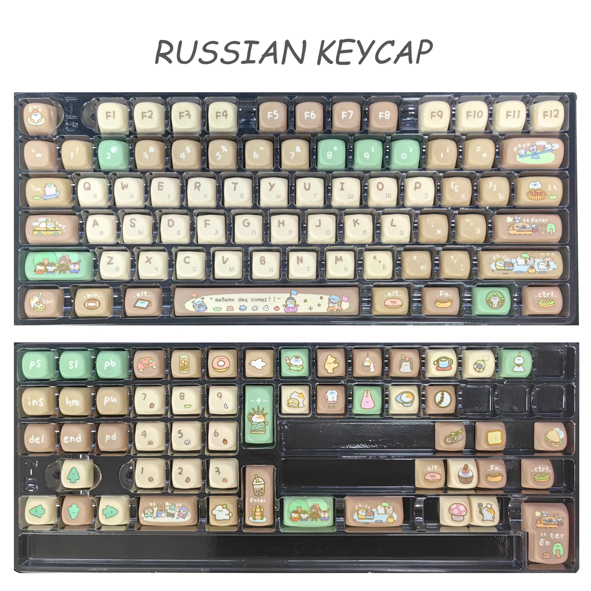
For compact boards, that visual clarity matters because smaller layouts can become difficult to scan quickly when legends are dense. If you are pairing these caps with a dark case, the khaki tones should stand out gently rather than fight for attention, which makes the whole keyboard easier to read at a glance.
Who this set fits best
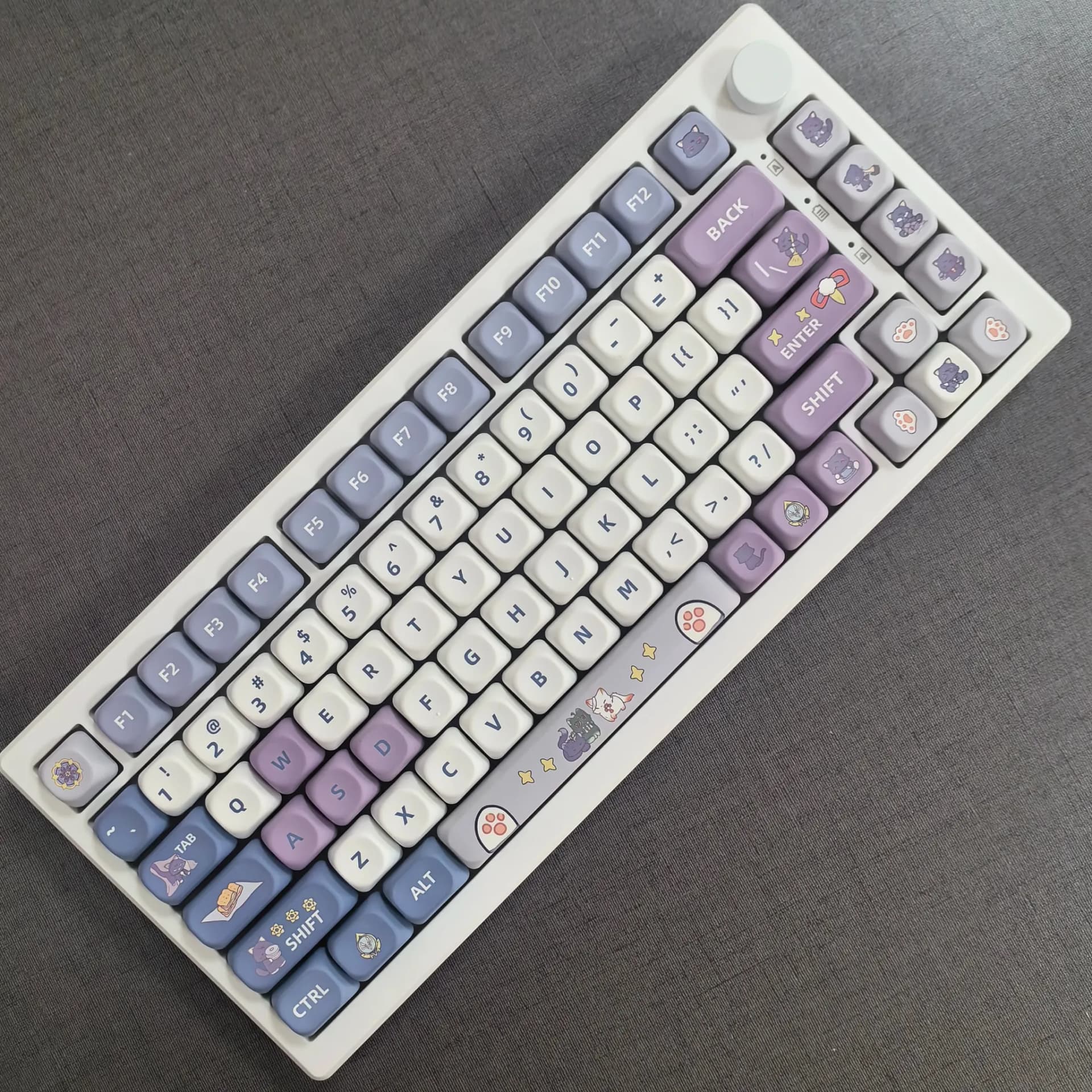
This is a strong match for enthusiasts who want a themed set that feels calm, tactile, and easy to live with every day. It is less about dramatic RGB contrast and more about a polished desktop presence that still feels friendly under the fingers.
- Good for aesthetic mechanical keyboard builds with muted tones.
- Well suited to bilingual typing setups and collectors.
- Useful for users who prefer a rounded, softer keycap feel.
- Better for style-first setups than pure gaming-focused builds.