





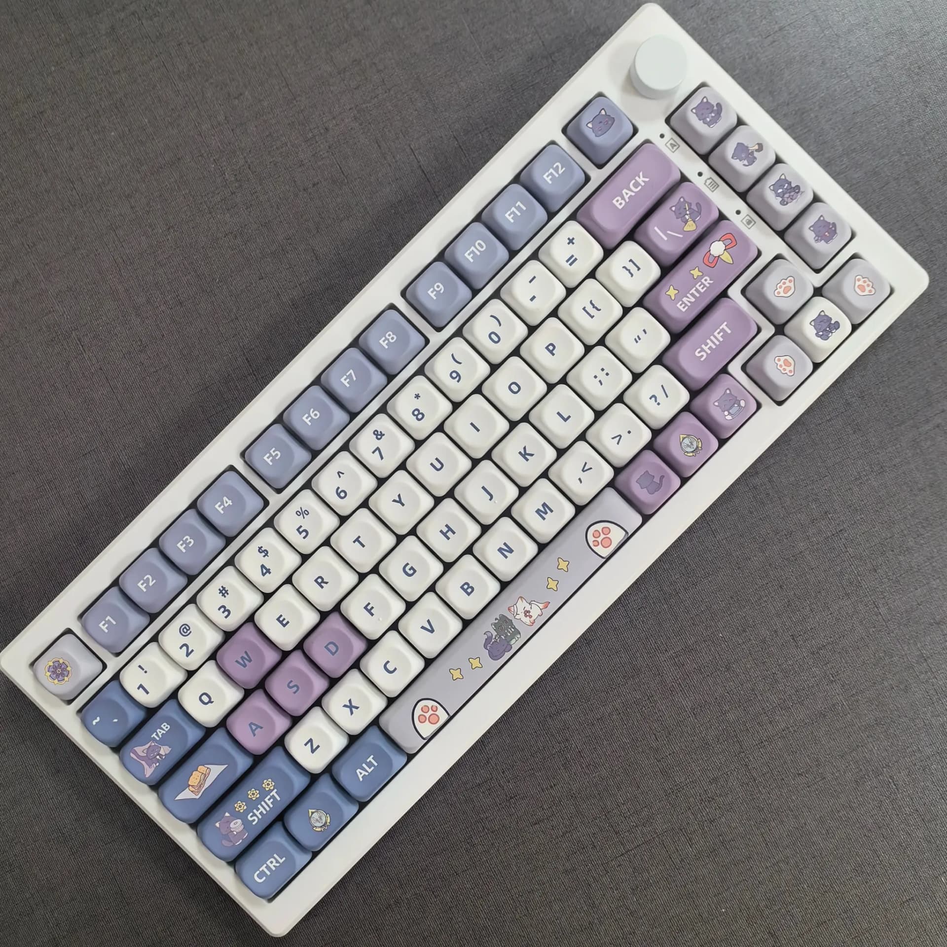
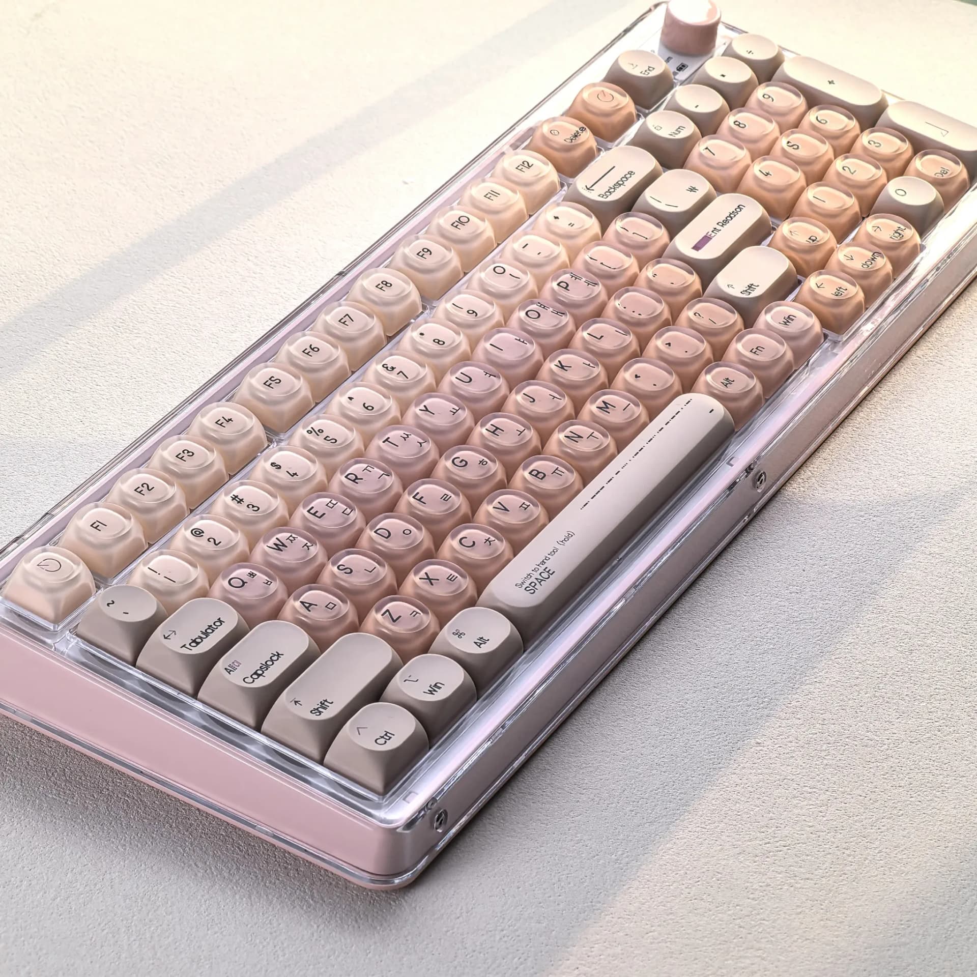
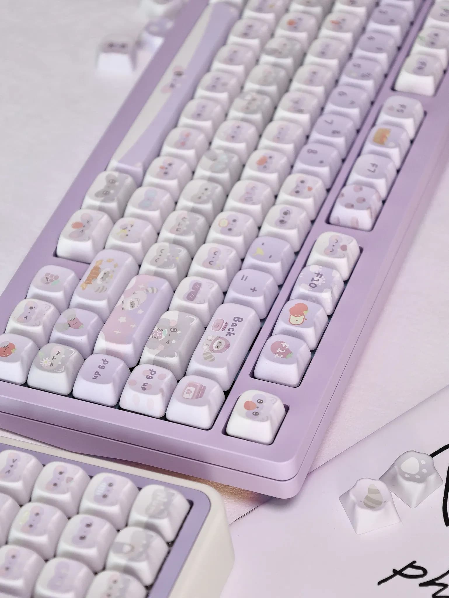
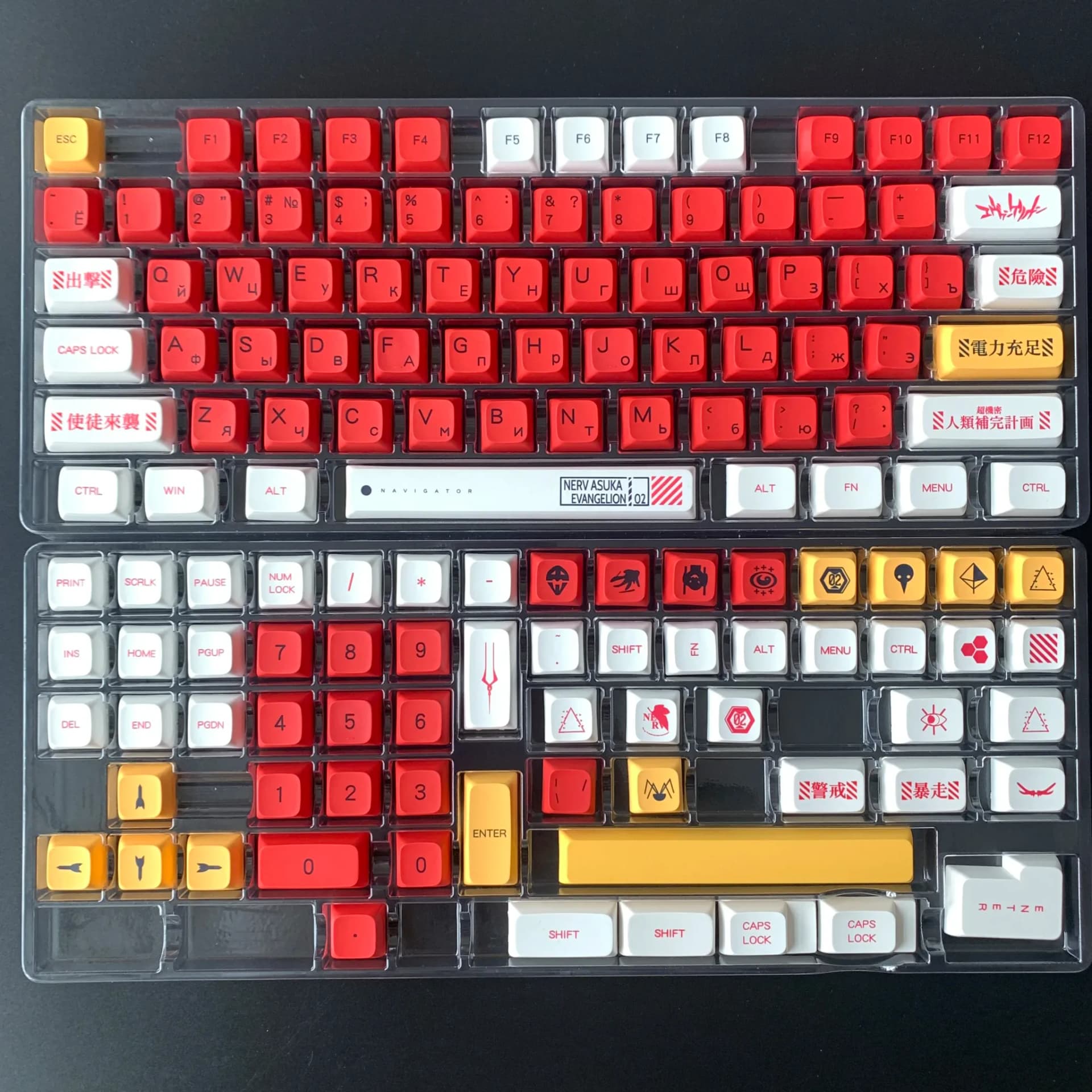
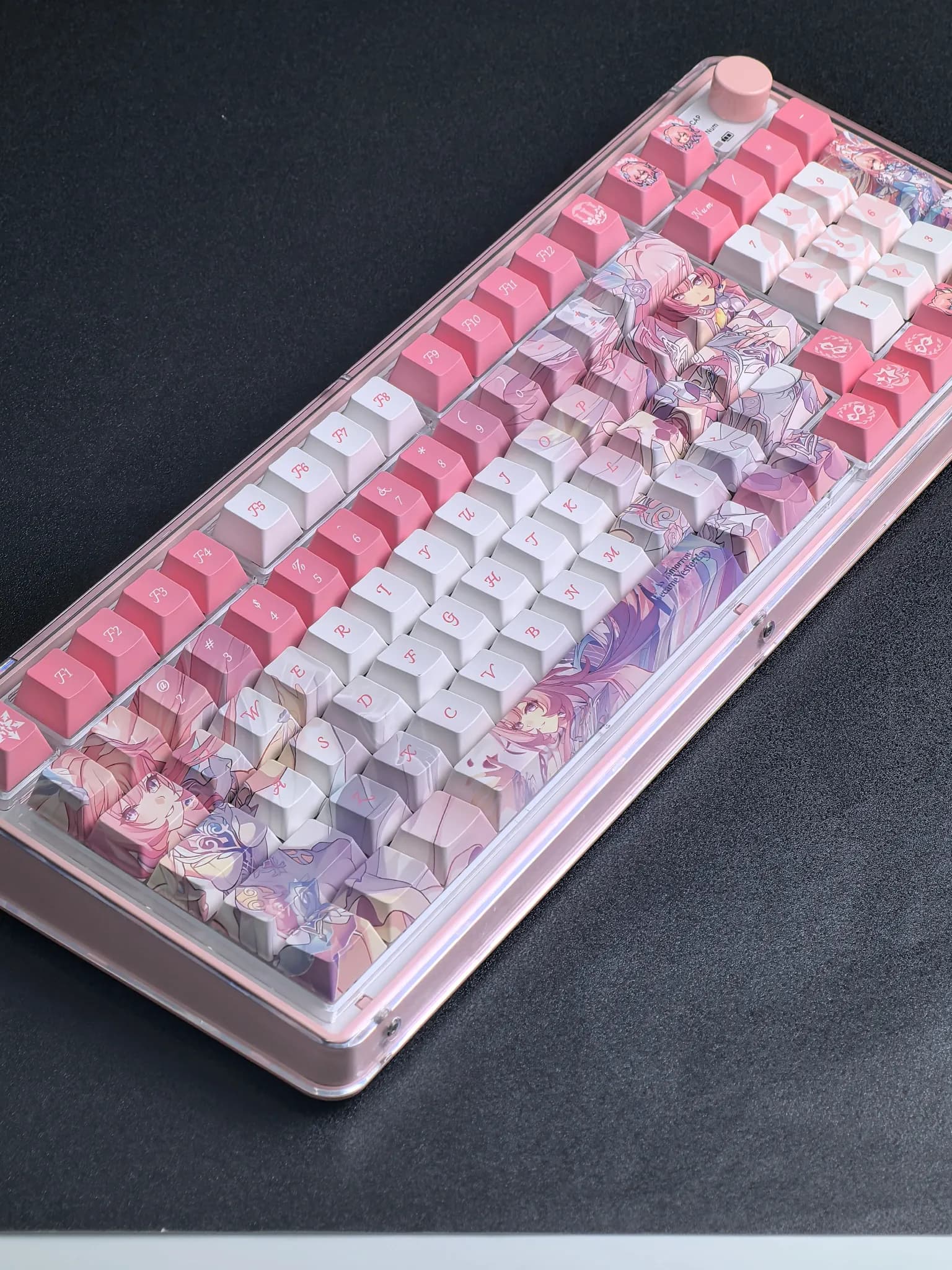

Architectural styling that changes the whole board
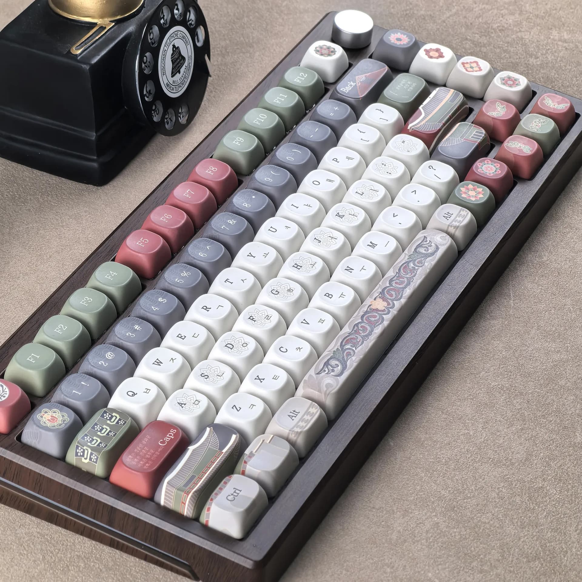
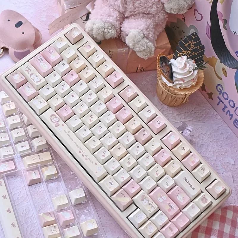
This set solves a common problem in custom keyboard builds: a board can type well and still look generic. The Gyeongbokgung Palace theme gives it a more curated identity, with side engraving and translucent white sections that create a layered, almost lantern-like effect under RGB.
That visual shift matters because keycaps are the first thing you see and touch on every session, and this set aims for atmosphere as much as function. If you want a build that feels more personal than a standard dye-sub set, this is where the design starts to earn its place.
PBT feel with a cleaner everyday texture
The keycaps use PBT, which usually means a drier, more textured surface than glossy ABS after long use. In practice, that gives fingertips a firmer grip and helps the board keep a fresh look longer, especially for users who type or game for hours.
The material choice also fits the price tier well, since PBT is one of the easiest ways to improve the tactile feel of an AliExpress keyboard upgrade without changing switches. If your current caps feel slick or thin, this is the kind of swap that you notice within minutes, so what does the layout bring to the experience?
MOA profile and Cherry compatibility: comfort with a caveat
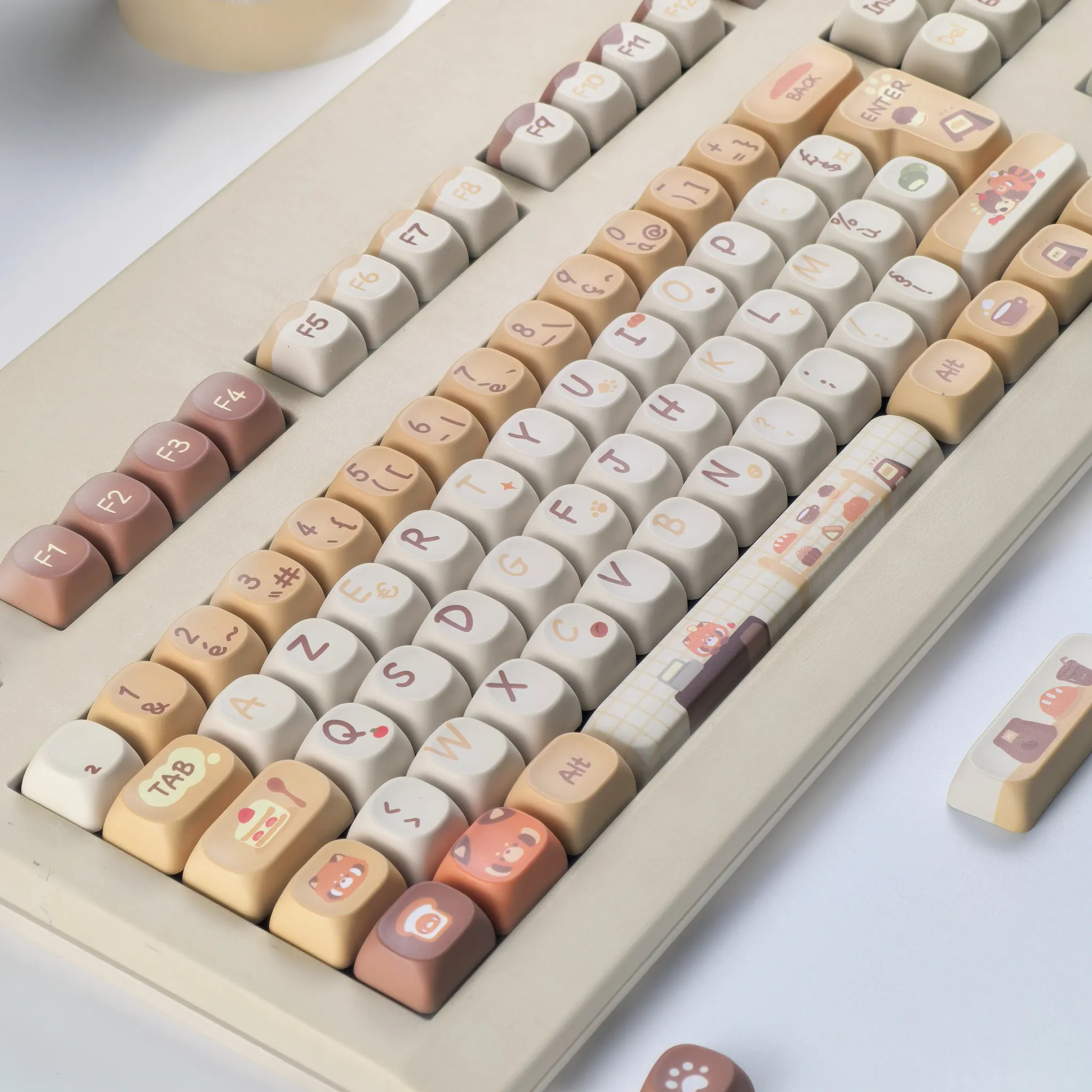
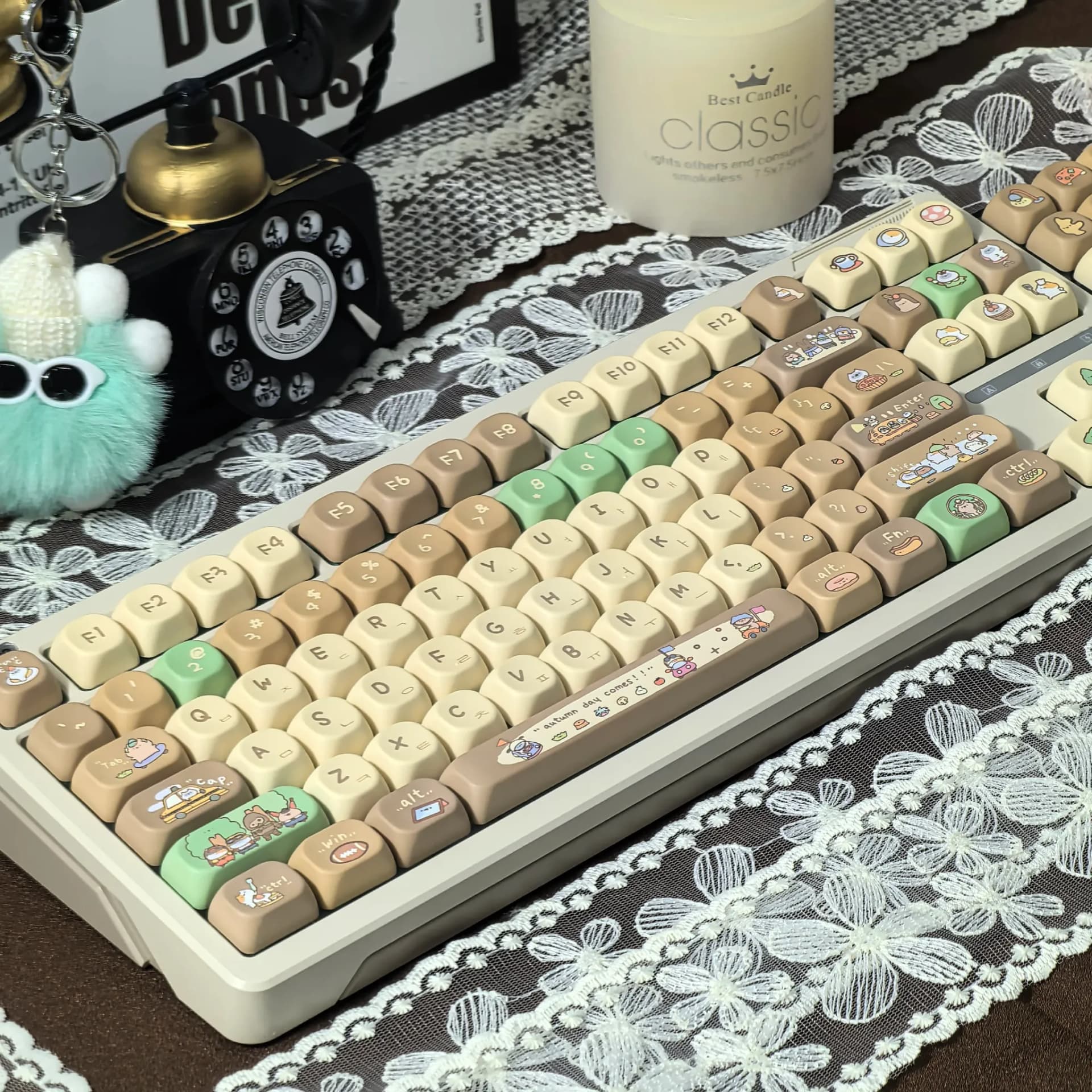
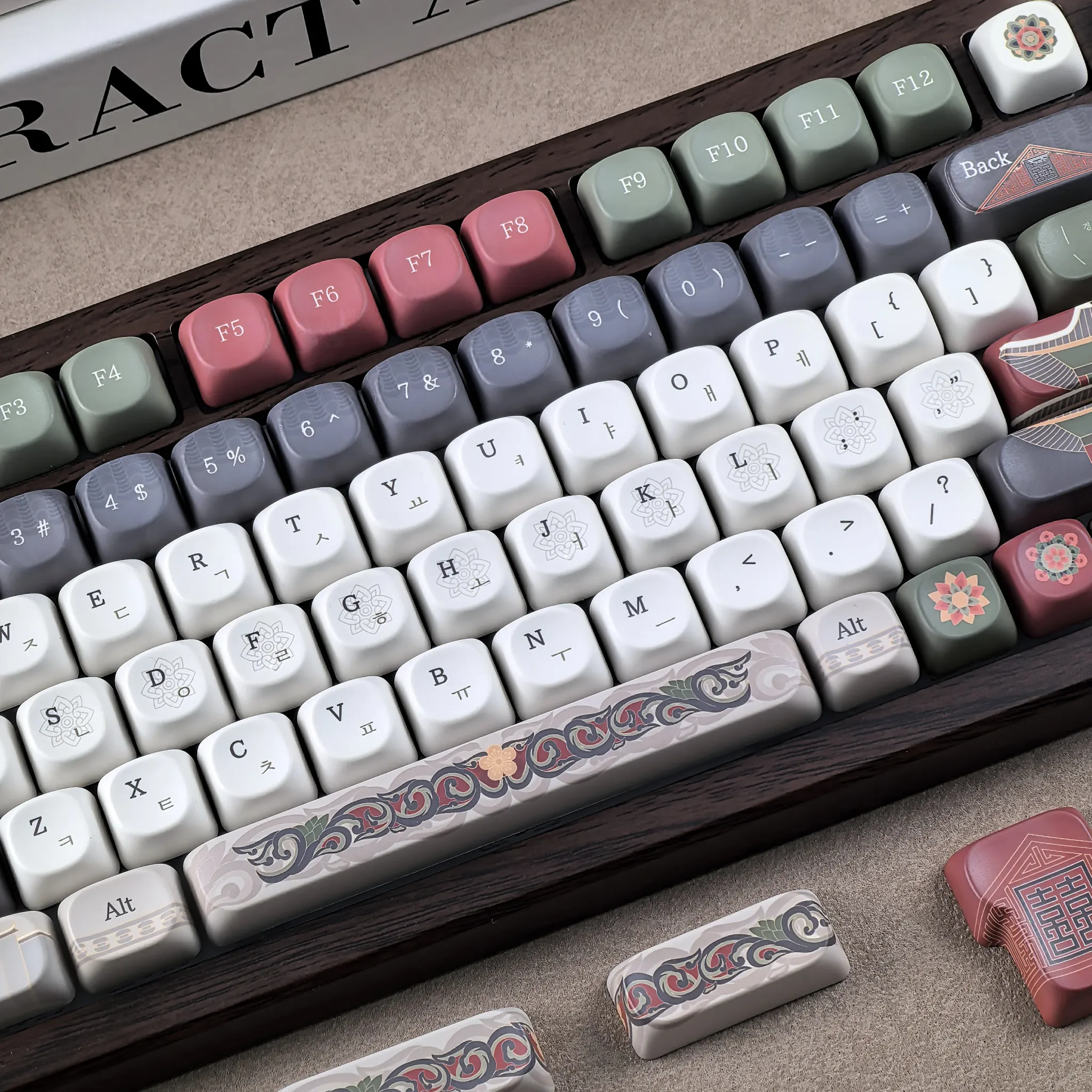
The MOA profile is shorter and rounder than traditional Cherry or OEM sets, which usually makes the board feel softer under the fingers and a little more compact visually. That rounded top can be pleasant for long sessions, though it will feel different from the sculpted rows many users are used to.
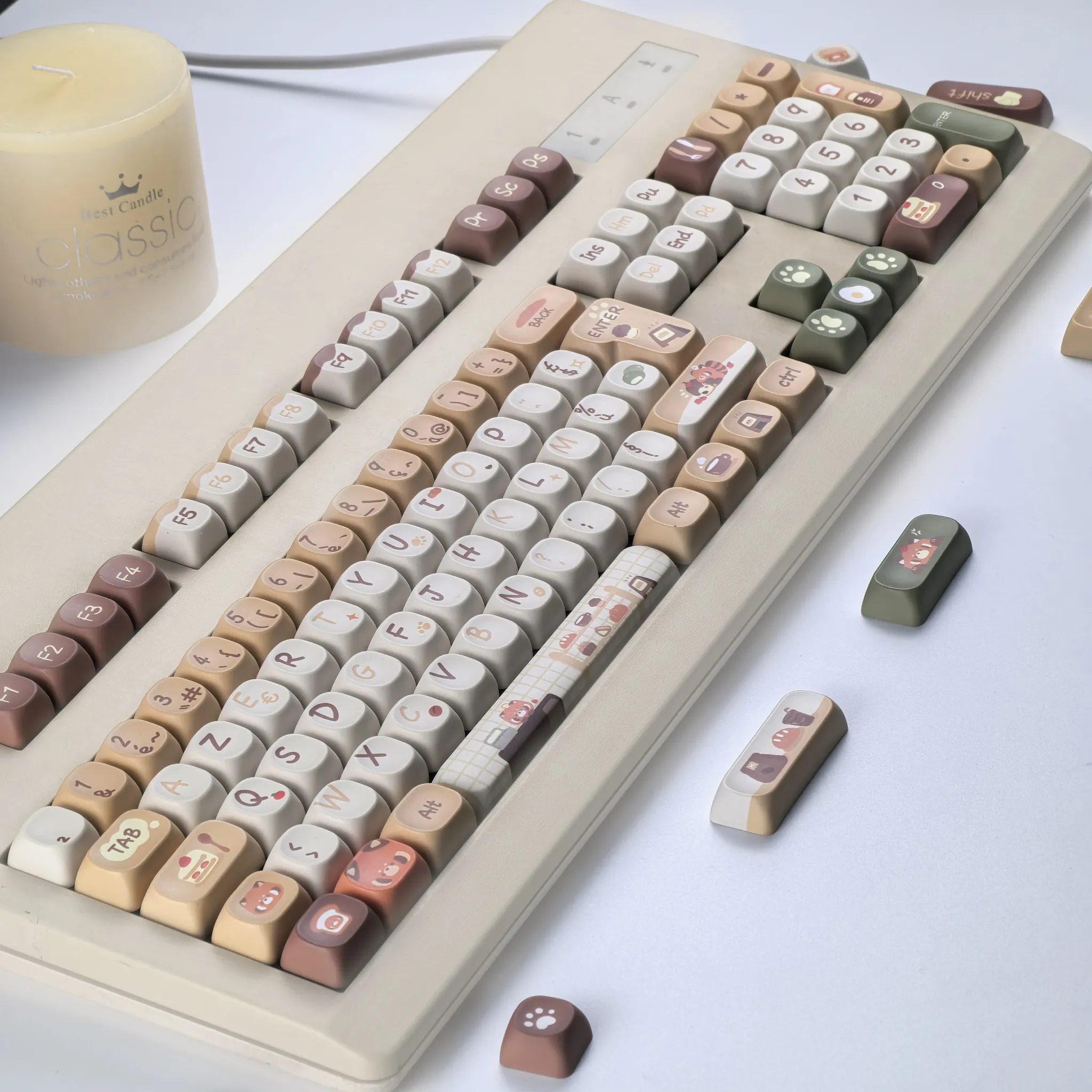
Compatibility is the part that deserves attention: the listing references ANSI/ISO support and a 6.25u spacebar, which is useful for common 60% to full-size mechanical boards. Users with unusual bottom rows, split spacebars, or nonstandard layouts should verify fit before assuming the set will cover every key, and that leads directly to the lighting behavior.
Side engraving and translucent panels under backlight
The side-engraved legends are the main practical advantage here, because they keep the top surface visually cleaner while still leaving labels visible from the edge. Users in the reviews repeatedly noted that the side text stands out best when the board has LED lighting, which matches the design intent.
There is one detail worth knowing: the white areas are patterned by design, not stained, so the finish is intentionally decorative rather than plain. That makes the set more distinctive on camera and on a desk, but it also means buyers who want a fully minimal look may prefer a simpler translucent cap set instead.
Who this set suits best
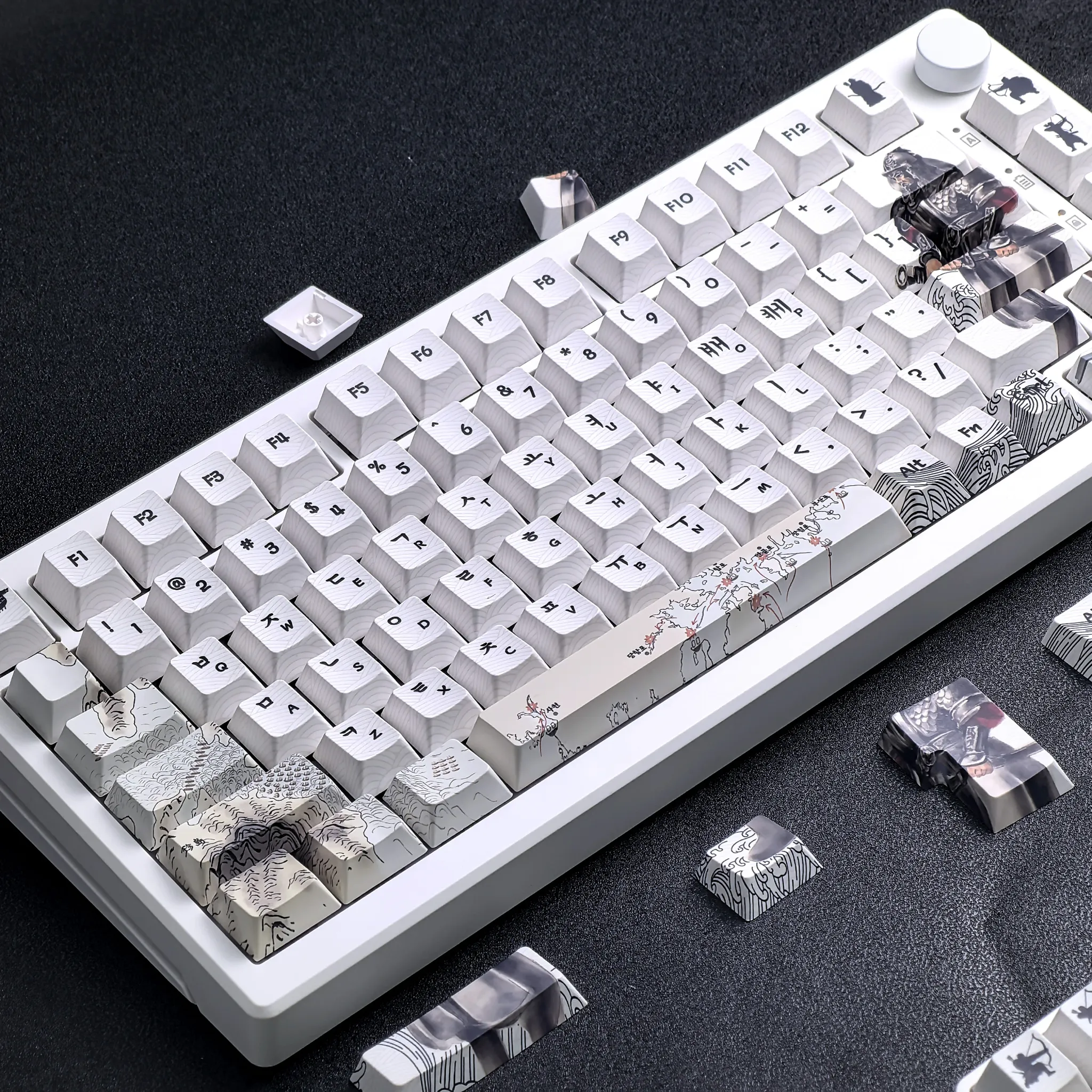
This is a strong fit for users building a themed mechanical keyboard around Korean aesthetics, warm RGB, or a display-first setup. It is also a practical choice for anyone replacing worn stock caps and wanting a set that feels more refined without moving into premium artisan territory.
According to customer feedback, the fit and overall appearance are the main wins, while print sharpness can vary slightly from cap to cap. That tradeoff is common in this price range, and it is exactly why the strongest buyers are the ones who value presentation, texture, and layout flexibility over perfection in micro-printing.
- PBT surface with a dry, durable typing feel
- Side-engraved legends for a cleaner top surface
- Translucent white sections for RGB visibility
- MOA profile for a softer, compact feel
- ANSI/ISO compatibility for broad board support
- Theme-driven Gyeongbokgung Palace design
- Fits many 60% to full-size mechanical keyboards